Table of Contents
Colors can alter trust and many other factors in branding
Using color psychology in branding is similar to using Google Fonts pairings. That’s to say when used properly, and not in a deceptive way, colors can play a huge part in visual branding to influence your audience to feel a certain way about products, people, and the brands themselves. This can heavily reinforce your brand’s mission and story.
In this guide I’ll break down the 10 choices for primary brand colors and the color psychology behind them to help you decide which color your brand should use.
Red’s Branding Color Psychology
Red is one of the most expressive colors because it has been scientifically proven to elevate blood pressure, respiration rate, and overall attract attention because of its boldness.
Red as a primary branding color can be pretty versatile because it can influence a lot of different emotions within your audience based on how it’s used such as the shade, the amount it’s used, what visual elements it’s used on, and the tone of the content that pairs with it.
Here are some of the emotions and adjectives red can evoke:
- Excitement
- Passion
- Love
- Power
- Strength
- Motivation
- Anger
- Danger
You may think that red would only be used for brands that have to do with love, romance, and Valentine’s Day, but that’s far from the truth.
The real world usage of red in branding
I’m using red as my primary brand color, not because it’s my favorite color, but because it resonates with my audience most.
My logo uses red as a primary brand color
No, I don’t mean all people who work with me love the color red. What I mean is that red symbolizes the type of people I work with; Passionate business owners who are excited about making a difference – who love working in their business and have that charge to them. These are my people – the people I serve in my business.
On the flip side, I also feel this way about my own work and working with these types of people. I believe that my brand is powerful enough to be the change for other businesses.
Who should use red as a primary brand color?
Brands whose customers are passionate / loving, offer bold and exciting products or powerful services – brands that stimulate their customers’ appetites and desires, or involve action will best make use of red’s color psychology.
When you think of brands that fall under those feelings, brands like Adobe, Netflix, YouTube, Chick Fil A, and Marvel come to mind.
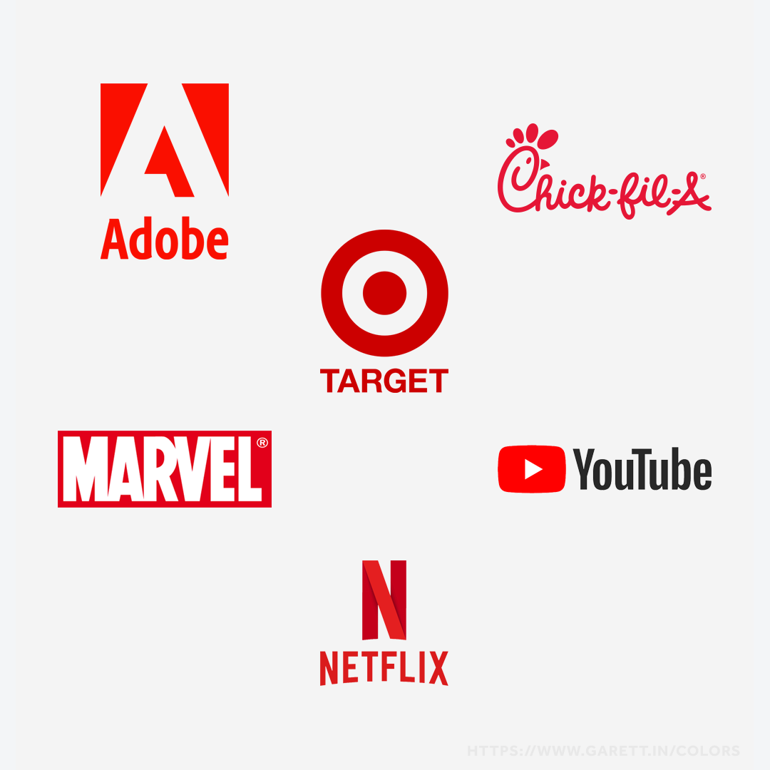
Popular brands that use red as their primary branding color
Blue’s Branding Color Psychology
Blue often represents the familiarity many of us see daily in the sky and ocean water, which is probably why scientifically it’s linked to slowing the heart rate and calming your mind.
This is likely why blue is one of the most used colors in branding – that familiarity influences us to trust, but there’s more to it than just that. The composed nature of blue creates contrast to the feelings set off by others.
Here are some of the emotions and adjectives blue appeals to:
- Trust
- Relaxation
- Inspiration
- Reliability
- Confidence
- Serenity
- Unsavory
- Sadness
Blue can be a great way to relax your audience and to show them you’re trustworthy, but be careful not to overdo it or use it in the wrong industry, such as in dining. When it comes to food, there is little to no naturally blue foods, so most find this to be a turn off in relation.
The real world usage of blue in branding
Many brands use blue because studies prove that it appears more trustworthy. After all, people will only buy from your brand if they trust it.
Amex’s logo uses blue as a primary brand color
Financial brands such as Amex, PayPal, and Barclays use shades of blue as their primary brand color to represent trust with money. They want to know you can rely on their companies. Other brands, like in the medical field, want you to believe you can trust them with your health.
Who should use blue as a primary brand color?
Brands where trust is the biggest purchase factor (like banks and investments), where reliability isn’t an option, or where they need to keep their customer relaxed through the buying / use process will have the most success with blue as a primary brand color.
Think of brands like GE, SAP, Skype, or even most political figures – they all rely on blue to help their audience trust them.
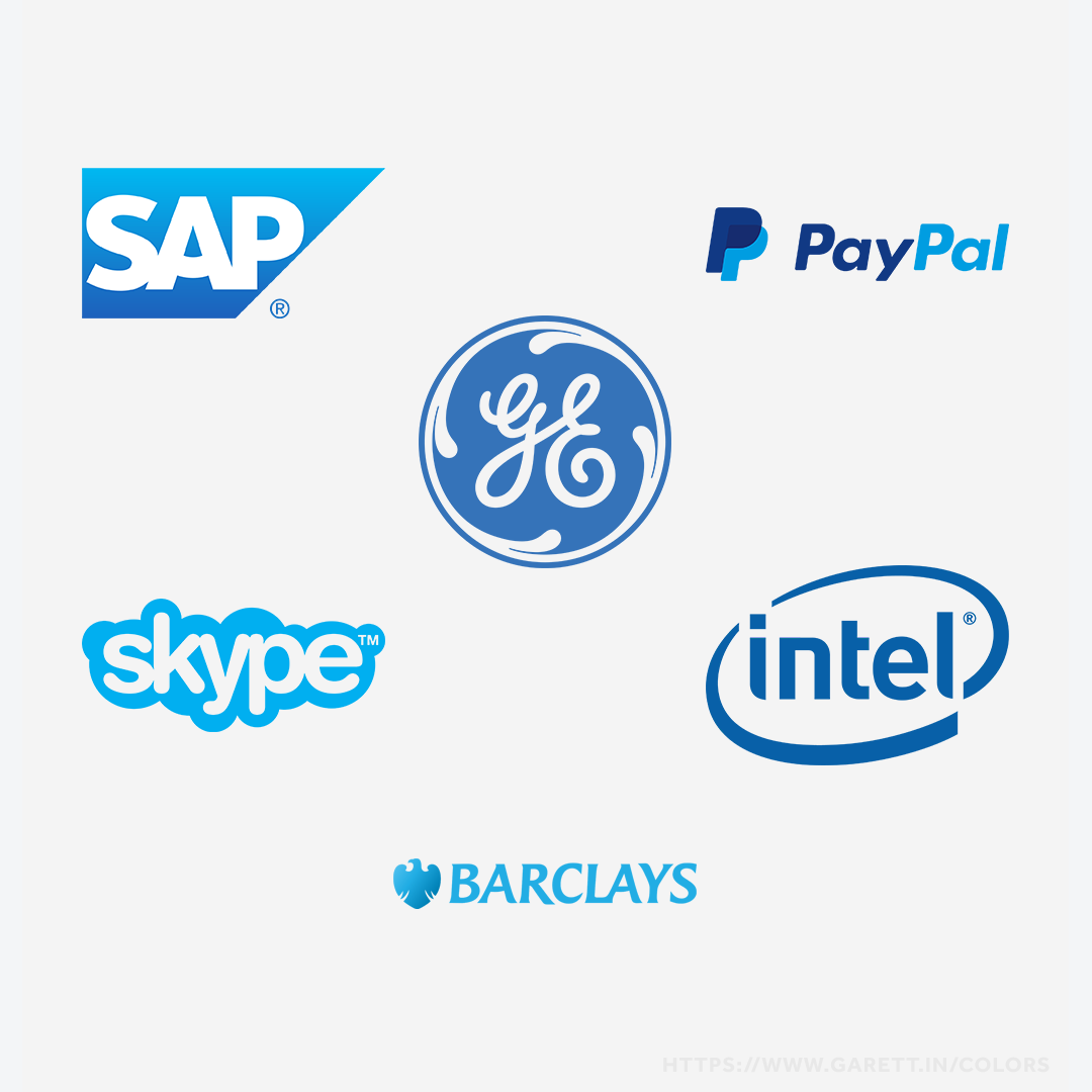
Popular brands that use blue as their primary branding color
Yellow’s Branding Color Psychology
Yellow is the color of sunshine and bright light, which is why we as humans commonly associate it with happiness and energy.
As a primary brand color, yellow is one you won’t see as often as the other two primary colors, red or blue. This most likely has to do with that when used poorly, shades of yellow can be quite potent and harsh on the eyes.Still, yellow can still serve as a color of vibrant energy and visibility.
Think of what’s yellow – natural or artificial. What purposes do they serve? They tie in with its brand color psychology.
Here are some of the traits and adjectives associated with yellow:
- Happiness
- Enthusiasm
- Speed
- Friendliness
- High Visibility
- Warmth
- Anxiety
- Irrationality
Yellow can be a great way to capture attention and remember things – this is why it’s used for highlighters and street signs, but it’s definitely not limited to that.
The real world usage of yellow in branding
Yellow is often used by brands like Best Buy, who hope to energize their eager tech-obsessed customers by getting the latest tech in their hands. It doesn’t hurt that you can see a glowing yellow Best Buy logo from far away when driving down highways or pulling into big outdoor shopping malls.
Nikon’s logo uses yellow as a primary brand color
A lot of brands use yellow to represent speed and quickness. This is why a lot of fast food restaurants use yellow. The essence of yellow also applies to Nikon, as it symbolizes the speed of their cameras and lenses matched to get the perfect shot.
Who should use yellow as a primary brand color?
Yellow is best used as a primary branding color by brands that need to tap into the happiness for high cost or quantity purchases, fast moving brands where speed is a purchase factor, brands that need high visibility (like taxis or gas stations), or friendly brands.
Examples of brands that serve the traits behind the yellow color psychology are Ferrari, NatGeo, McDonalds, and MailChimp.
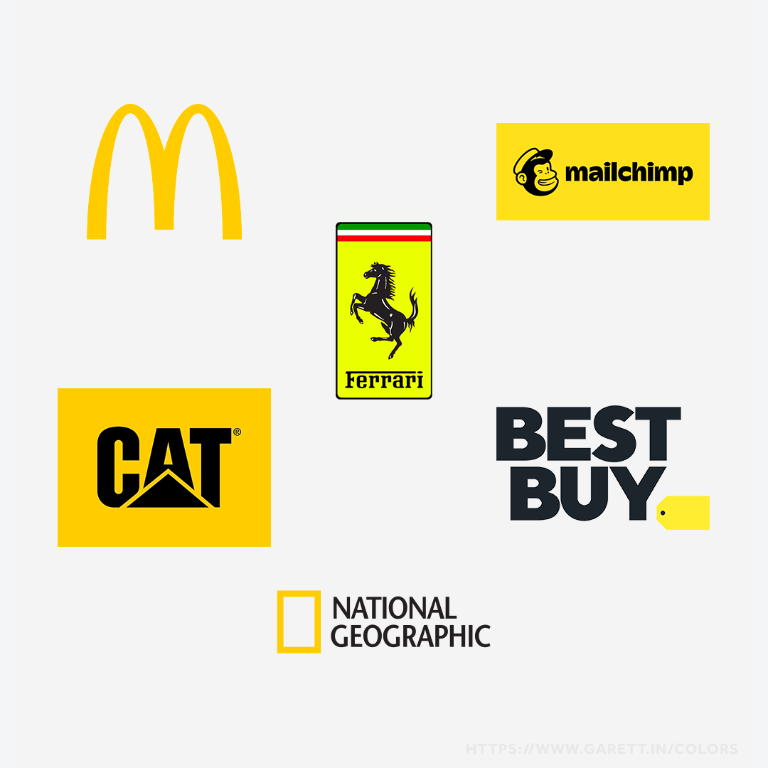
Popular brands that use yellow as their primary branding color
Orange’s Branding Color Psychology
Orange is usually attributed with either being cheerful, adventurous, or way out there – think Halloween; a spooky, yet fun celebration.
When it comes to branding, orange is one of the least used colors. This is most likely because it’s often linked with being economical in value or “out there”.
While orange is a combination of red and yellow, it shares more traits with yellow than it does red. Here are the emotions and adjectives orange can evoke:
- Cheerfulness
- Adventurous
- Friendliness
- Optimism
- Energy
- Experimental
- Economically Valuable
- Boldness
Orange is one of those colors that people either love or hate. Either way, it will cause your audience to immediately feel some type of way.
The real world usage of orange in branding
Using orange as a primary brand color is usually a sign that you’re either adventurous, friendly, or economical in value.
Dunkin’s logo uses orange as a primary brand color
Dunkin’ uses orange to represent their friendly morning cheer and great value compared to their morning commute competitors. On the other hand, Harley-Davidson encourages that morning commute to be a bit adventurous on one of their motorbikes.
Who should use orange as a primary brand color?
Orange can benefit brands that are highly active or based on travel, brands that offer affordable products with good value, brands with experimental products, or energetic brands that don’t want the extra visibility of yellow.
Some brands that embrace the meaning of orange are Nick, Home Depot, Penguin Books, and JBL.
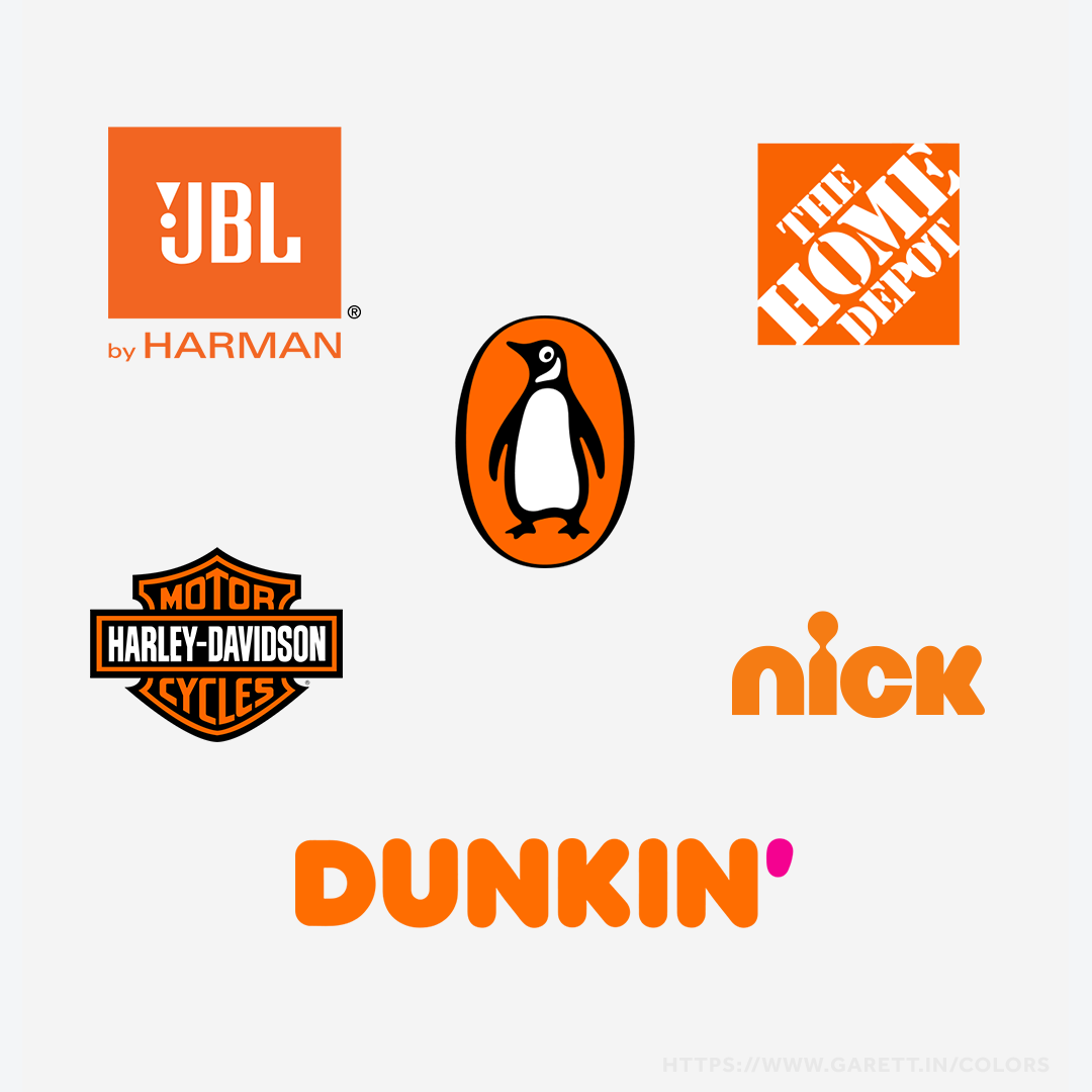
Popular brands that use orange as their primary branding color
Purple’s Branding Color Psychology
Purple is a color rarely seen naturally and is harder to produce physically – this is why it’s most often associated with imagination and luxury.
This heavily ties in with using purple as a primary branding color – afterall, it is the color of royalty.
Here are the emotions and adjectives tied with this majestic color:
- Luxury
- Ambition
- Wealthiness
- Creativeness
- Imaginative
- Mysteriousness
- Arrogance
- Immaturity
Being a mixture of red and blue, purple evokes some related traits from both, like honor and creativity – this can be great for branding.
The real world usage of purple in branding
Purple is usually used as a primary color when a brand wants to be positioned as higher end or more innovative.
Wonka’s logo uses purple as a primary brand color
Wonka Candy is a great example of a brand that signifies the traits of purple. While they could be around double the price of their checkout line competitors, they’re regarded as a superior tasting product.
To add to that, no one can say that Wonka isn’t imaginative, as it’s been transformed into a world of its own through a book, movies, and a play. It’s no wonder that even though the company has been sold a few times to large parent companies, it hasn’t been absorbed.
Who should use purple as a primary brand color?
Brands that are highly creative or imaginative, brands with a deeply-rooted rich history, or brands that offer premium quality products will benefit most with purple as a primary branding color.
Other brands that represent the royalty of their industries with purple are AVID, Hallmark, Twitch, and the LA Lakers.
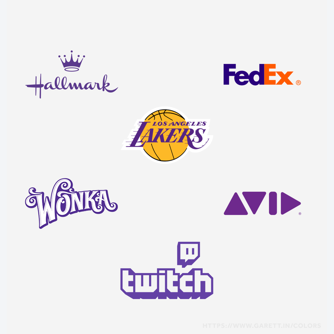
Popular brands that use purple as their primary branding color
Green’s Branding Color Psychology
Green is another powerful color that resonates with us because of the familiarity found in nature.
When it comes to green as a primary branding color, it’s a bit more personal than blue, as it connects more so from within – think of inner peace and zen.
Green is made with blue and yellow, which is why it relates to some of their emotional traits.
Here’s what emotions and adjectives you can capture in your brand:
- Growth
- Harmony
- Calmness
- Optimism
- Spiritual
- Healthiness
- Jealousy
- Greediness
Growth and health seem to be most associated with green psychologically because of the correlation to trees, plants, and vegetables, but it’s certainly not limited to that.
The real world usage of green in branding
Using green as a primary brand color works best in brands to symbolize harmony and balance – either within ourselves or the world.
Whole Foods Market’s logo uses green as a primary brand color
Whole Foods is the perfect example of a brand using green as their primary brand color to represent the healthier, organic products they sell, while also bringing you peace of mind.
A less obvious example would be Spotify – as a streaming service, its mission is to relay growth, harmony, and grounding as it connects us through music, podcasts, videos, and other digital content.
Who should use green as a primary brand color?
Green works well for brands that aim to bring your mind, soul, and body peace, along with brands that are in tune with spirituality and nature, health brands, or companies that are moving towards being environmentally green.
When it comes to using green for branding, think of brands like Tropicana, Starbucks, BP, and John Deere that are tapping into those color traits.
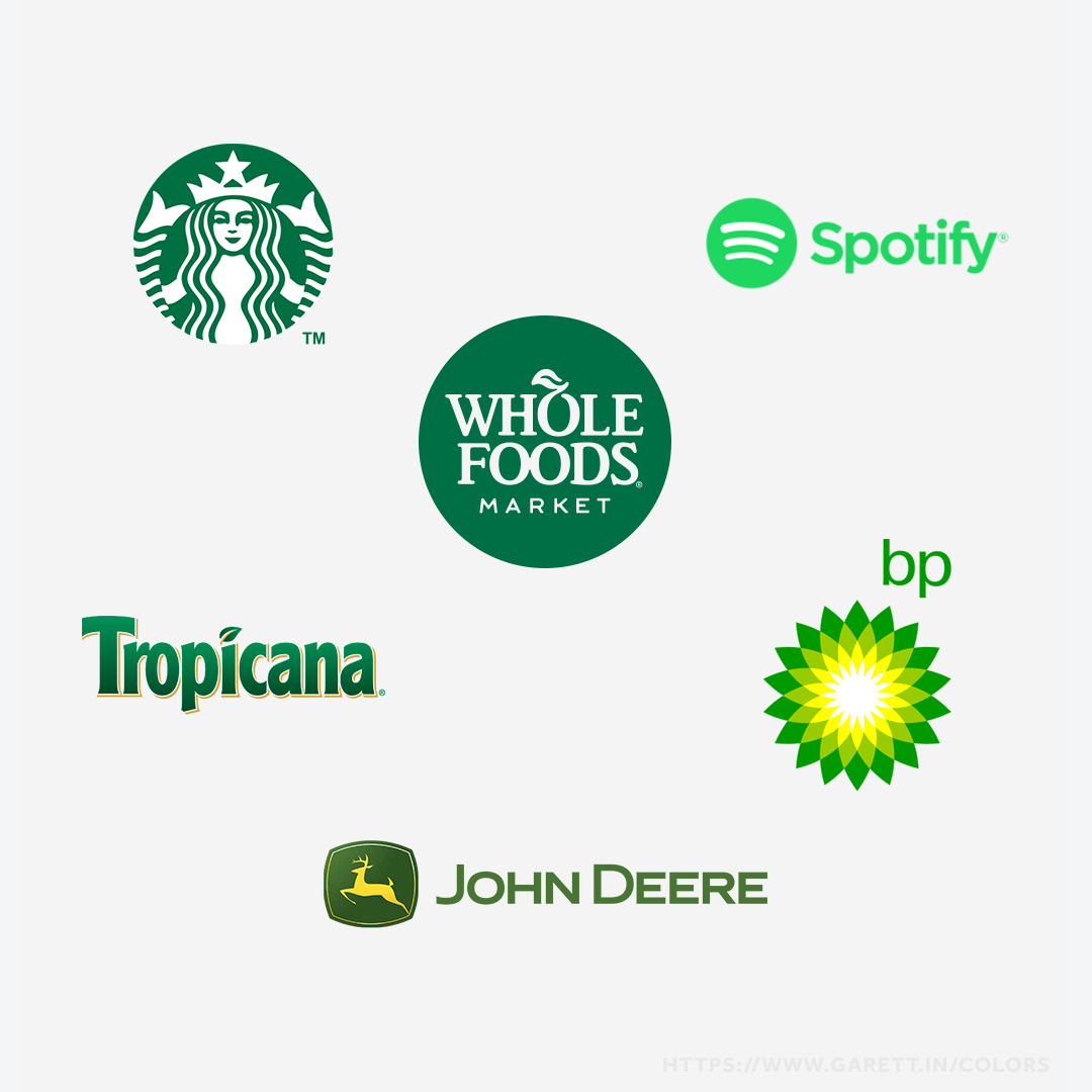
Popular brands that use green as their primary branding color
Pink’s Branding Color Psychology
Pink is a nurturing and loving color that often gets thrown up to being described as feminine just because it’s traditionally associated with toys marketed to girls – which is bullshit.
When it comes to branding and design, feminine is represented for what it truly is: empowerment and desirability, along with gentleness. Think sugar and spice.
Pink can represent much more than just femininity though. Here’s some emotional and adjectives traits of pink:
- Femininity
- Nurturing
- Vibrancy
- Romantic
- Nostalgia
- Empowerment
- Sensitivity
- Innocence
Though often seen as a gender stereotype, pink offers much more – such as power when used to show a brand’s innocence or nostalgia.
The real world usage of pink in branding
Victoria’s Secret is a great example of a brand that uses pink, not because it’s “girly,” but because their products empower women to be desirable – the proper meaning of feminine.
Taco Bell’s logo uses pink as a primary brand color
Taco Bell is another great brand that uses pink in their branding to stand out from other fast food brands, while representing nostalgia of old style Mexican restaurants.
Who should use pink as a primary brand color?
Pink is great for brands that are vibrant, creative, and offer their customers a sense of nostalgia, innocence, or empowerment. Brands that are nurturing in spirit and helpful to their customers are also a great fit.
Brands like LG, Dribbble, Baskin Robbins, and Vineyard Vines all offer the feeling of either creativity, nostalgia, or empowerment that pink taps into emotionally.
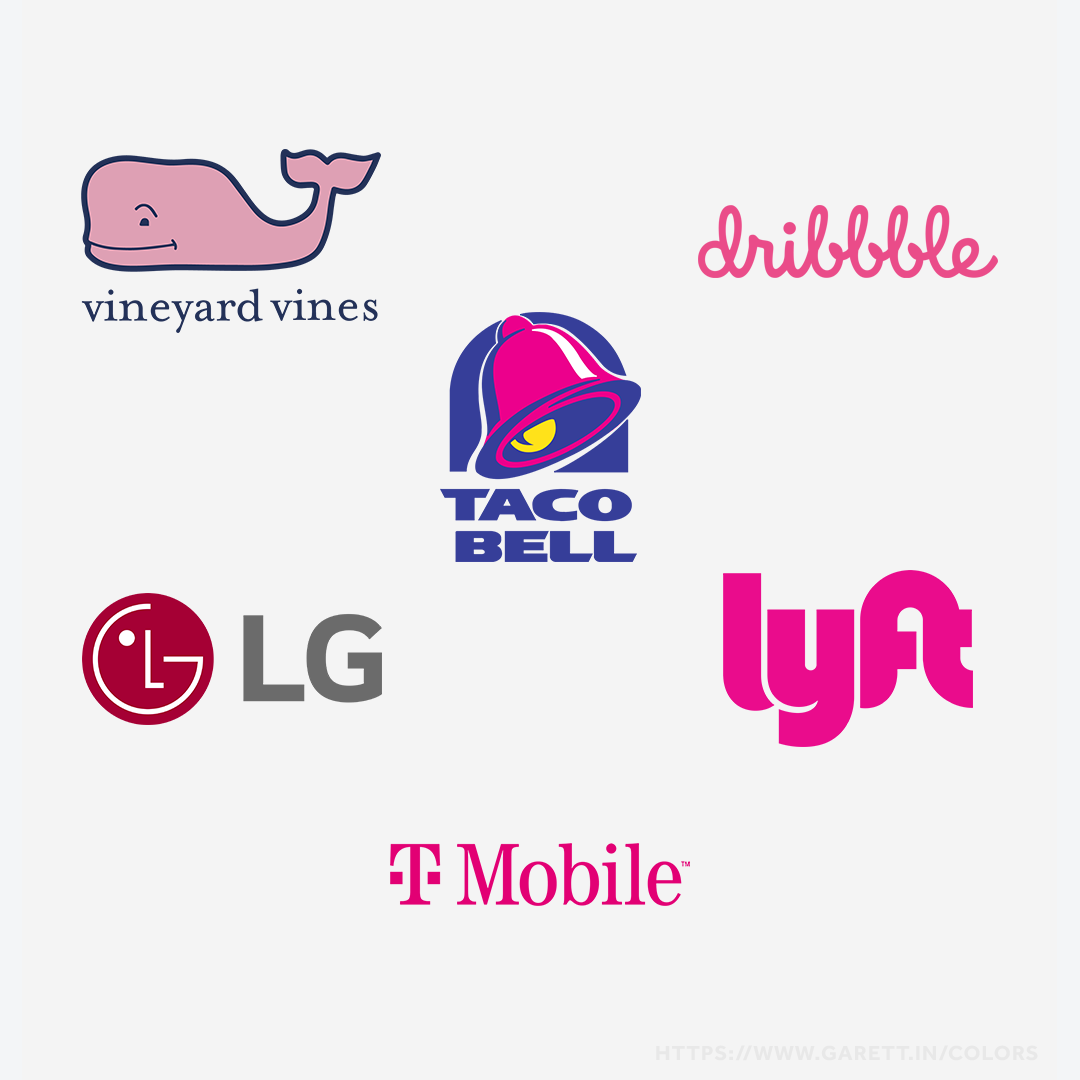
Popular brands that use pink as their primary branding color
Brown’s Branding Color Psychology
Brown shares a lot of the same familiarity traits as green, as it’s also a color that is primarily seen in the natural world outside of greenery and water.
When it comes to using it as a primary brand color, brown is mostly described as feeling earthy, but it can invoke some surprising emotions.
Here are the emotional and adjectives traits of brown:
- Reliability
- Wholesomeness
- Harmony
- Strength
- Security
- Down-to-Earth
- Practicality
- Dullness
Some may associate brown with dullness or as being unexciting, but it’s often used to represent strength and maturity.
The real world usage of brown in branding
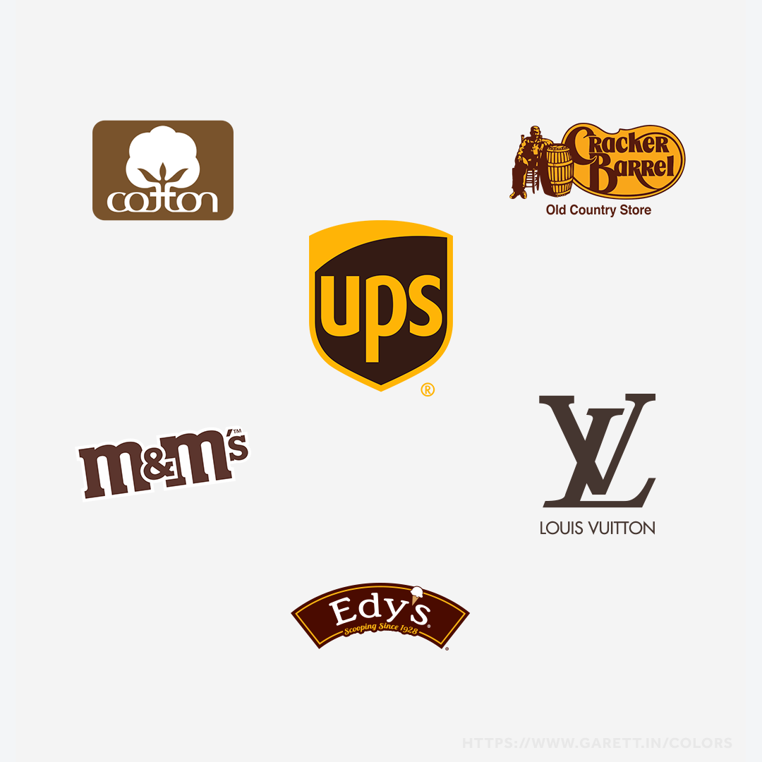
The most famous brand using brown as a primary color would have to be UPS. Brown works great for them as a primary brand color because it symbolizes their dependability and strength to deliver their customers packages all around the globe.
Louis Vuitton’s logo uses brown as a primary brand color
Louis Vuitton is another great example of a company that uses brown primarily in their bags and collateral. Not only does it symbolize their signature leather color, but also the reliability and durability of their luxury products.
Who should use brown as a primary brand color?
Brands that have strong reliable products and services, organizations that are wholesome and just want to provide some happiness, brands that are practical but don’t want to influence an intense emotion, or brands that are down-to-earth will do the best with brown as a primary brand color.
Some other great brands that employ the color psychology of brown are M&M’s, Edy’s, Cracker Barrel, and Cotton Inc.
Popular brands that use brown as their primary branding color
Black, White, and Gray Branding Color Psychology
In design, black, white, gray, and other shades in between like ivory or sand are considered neutral colors.
Note: We’re discounting brown as a neutral here because it does evoke its own set of feelings as we covered above. Though sometimes depending on the shade, it can cross into this color psychology as well.
Some brands don’t have a primary brand color and tend to rely on these neutrals, but that doesn’t mean there’s no color psychology involved.
Here’s what emotions and adjectives black, white, and all the grays in between capture as a brand color:
- Power
- Elegance
- Authoritative
- Modern
- Innocence
- Clarity
- Trendy
- Minimalistic
To make it straightforward, we are going to sum up all the neutrals into two categories – lighter neutrals and darker neutrals.
When it comes to a primary brand color, or therefore lack of, lighter neutrals tend to represent more of the innocent, pure, and minimalistic traits, while the darker neutrals are more powerful, authoritative, and fashionably trendy.
Overall, neutrals both light and dark can symbolize elegance, modernness, and clarity.
The real world usage of neutral colors in branding
A brand that tends to stick with the lighter neutrals would be Apple. Their goal is to make the world a better place with innovative technology and by keeping environmentally green (a sense of purity). I’ll still never forget when I saw my first MacBook Pro in 2010. When one of my audio engineering professors opened theirs up in a dim room with the keyboard lights glaring, it was elegance personified.
Prada’s logo uses a neutral as a primary brand color
On the darker side, a good example is Prada, a designer fashion brand with elegant high-end products that make their customers feel trendy and powerful.
Who should use neutrals as a primary brand color?
Neutrals as a primary brand color should be used by brands that serve luxury products or services, trendy brands that aren’t tied to a color for fashionable or trendy purposes, brands that are sleek and modern, brands that solve simple solutions in a minimalist way, straightforward brands, and brands looking to be the authority in their industry.
Think of some of the brands who don’t necessarily have a definitive brand color and rely on neutrals like Swarovski, Nike, Mercedes-Benz, and Wikipedia. What do they all have in common? They’re in a class of their own.
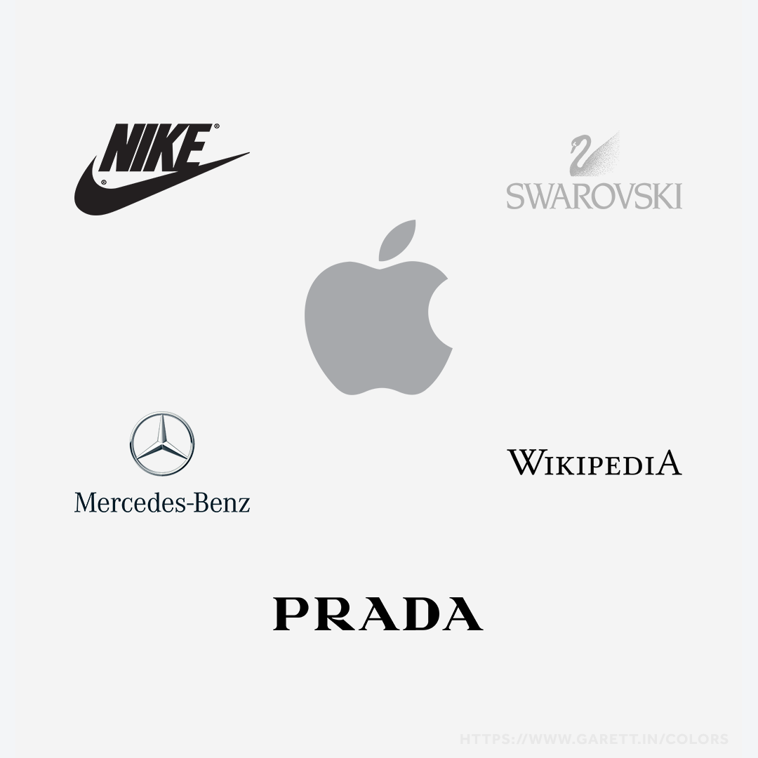
Popular brands that use neutrals as their primary branding color
Multi-Color Branding Color Psychology
According to Adobe’s Marketo, about 95% of brands use a single primary brand color. Why? Because they want to relate to, represent, and influence their customers to do or believe something.
Having more colors to focus on means there’s more to process, which in most cases can mean lack of action or in this case, feelings.
In addition to potentially combining the psychology of the colors used, multi-colored brands can also represent:
- Diversity
- Inclusion
- Unity
- Hopeness
- Confusion
- Immaturity
To be quite honest, there are just a few conglomerate brands that can pull this off due to how big they are and what they represent. A lot of times when a brand uses too many colors, or doesn’t use them properly, they look unprofessional.
The real world usage of multiple colors in branding
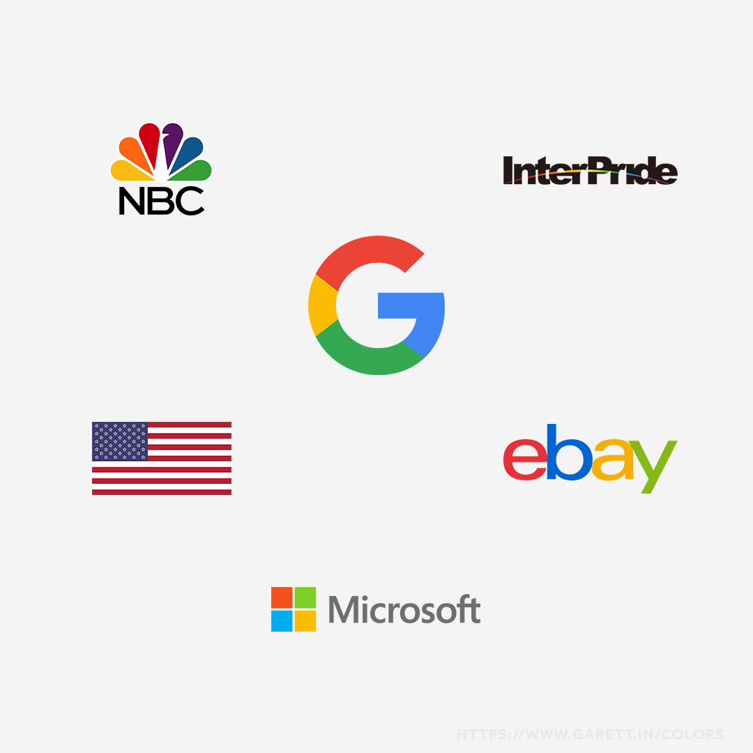
Google and Microsoft are at the forefront of being able to pull off a multi-color palette as a primary brand focus. Both use 4 color schemes to represent their suite of unique industry disrupting products and to show they are inclusive of diversion.
Google’s logo uses multiple colors instead of a singular primary brand color
There are also brands behind movements that use multiple colors instead of a singular primary brand color. These movements include Patriotism, which uses red, white and blue to represent our country, LGBTQ+, which uses a variety of color combinations to represent inclusivity, and Autism Awareness, which uses blue, red, and yellow to represent the significance behind their outreach.
Who should use multiple colors as a primary brand color?
Most likely your brand shouldn’t use multiple colors as it’s confusing. This is reserved for brands so well known that it wouldn’t confuse their audience like NBC or eBay, or brands with a strong connection to a movement like InterPride.
Popular brands that use multiple colors instead of one primary branding color
Much like logos, fonts, and collateral, colors are a tool in your brand system
It’s shocking to think that often overlooked details like your brand’s primary color can have such a subliminal impact on its perception. If like most people you’re struggling to pick out specific shades for your brand color, a good place to start for inspiration is Pantone Connect (a free account is more than enough). If you’re still stuck or want an expert opinion, I’d be more than happy to help over a Strategy Session.
Remember, the point of using colors in your brand isn’t to manipulate your audience, it’s to avoid sending the wrong impression and to strengthen the right message.
Does your brand’s primary color evoke the emotions related to your mission or story? Don’t just spin the wheel – your brand is not Twister. Carefully think through your choice before launch or a rebranding to maximize your brand system.