Typography plays a big role in branding
Your choices of brand typography can drastically change the mood or emotions behind your designs and messages.
If you’re looking for basic graphic tees for working out in, you probably would be off-put in checking out clothing from a brand using luxurious typography on social. This would be the case on the opposite side of the spectrum too. If you’re looking for a prom dress for your daughter, are you going to the store with a childish type in their logo or signage? I know I wouldn’t.
What makes a great font pairing?
Between the infinite amount of fonts available today and the subtle differences between some of them, it’s hard to give a definitive criteria of which fonts pair together and which don’t – it’s something that needs to be done on a case-by-case basis.
However, there’s some tricks to the trade to keep in mind when pairing fonts that can usually produce a good pairing:
- Using a serif and sans serif is a safer bet
- Avoid pairing fonts that look too similar
- Contrast is good – thick and thin, tall and compact, etc.
- Don’t mix scripts or heavily stylized fonts
- Fonts from the same typeface are almost always good
- Don’t go over 2 fonts in a pair (logo excluded)
- Never size display and body copy the same
Why Google Fonts? Are there alternatives?
Google Fonts is the only large trusted, 100% licensed to commercially use, and free-to-use webfont service that actually works. Since it’s run by Google and is used by hundreds of thousands of websites, the fonts are served from blazing fast servers – it won’t slow down your site under normal usage.
The only worthwhile Google Fonts alternative to mention is Adobe Fonts (formally known as Typekit). While Adobe Fonts is wonderful and has a great set of fonts to use, it’s a paid service, which doesn’t work for everybody.
30 Google Fonts Pairings with visual examples and which brands fit them best
I tried to create a wide variety of website mockups, articles, quotes, advertisements, and visual branding examples amongst the Google Font pairs below, but most will work in all branding and website environments – provided the mood fits your brand’s vibe.
Cantata One + Merriweather Sans
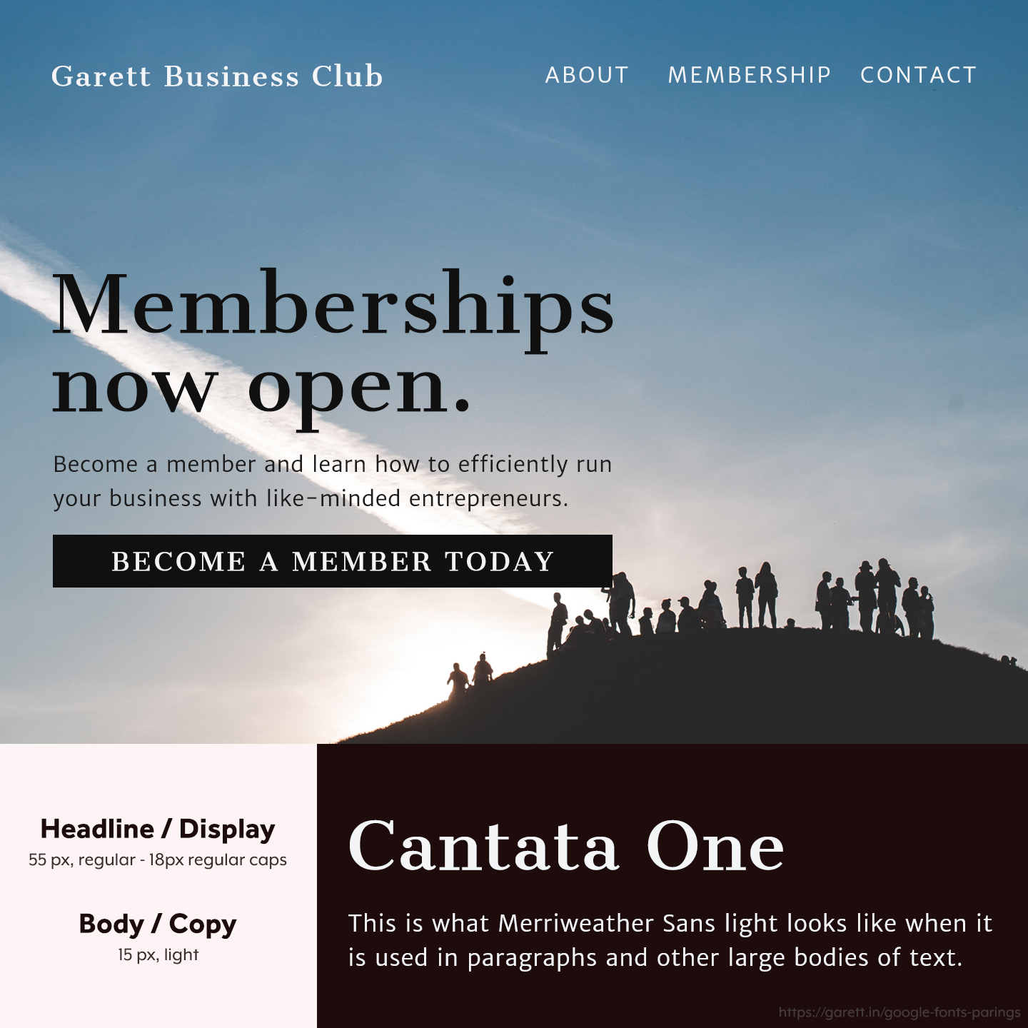
Cantata One is a great flowing serif that’s unique while not looking too informal or out there. When paired with Merriweather Sans it creates a timeless look that invokes the feeling of value.
This Cantata One and Merriweather Sans pairing is great for brands that are luxurious or selling high ticket items or value. Other brands that need to build trust like those in the financial or security space will do well with this pairing too.
Sacramento + Spinnaker

Sacramento is a classy script that could be both formal or casual depending on which font it’s paired with. When paired with Spinnaker though, this font combination is great for casual and playful brands.
I absolutely love the Sacramento and Spinnaker pairing on more minimal designs because it’ll shine with clean color schemes and white space. Casual brands with a blog, especially in the lifestyle industry will do best with this pairing.
Playfair Display + Alice
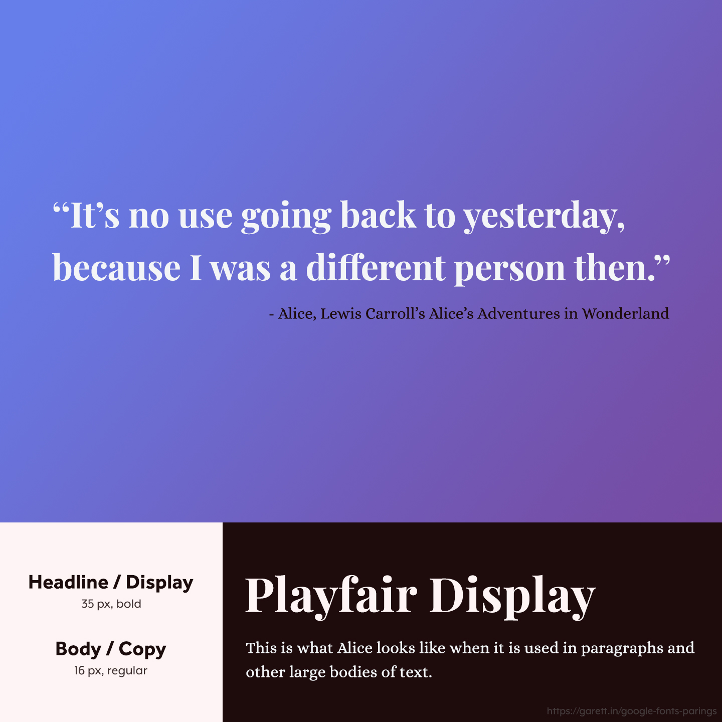
As seen in this social media quote example, Playfair Display shines when it’s big and bold – it’s definitely a great attention grabber amongst a sea of simpler sans serif fonts used in this way. Paired with Alice as a body copy (or in this case an author line), it makes for a traditional look with a modern twist.
I love the Playfair Display and Alice pairing for brands that are classy, exciting, and elegant. This also works well for modern and bold brands with an irreverent tone.
Unica One + Vollkorn
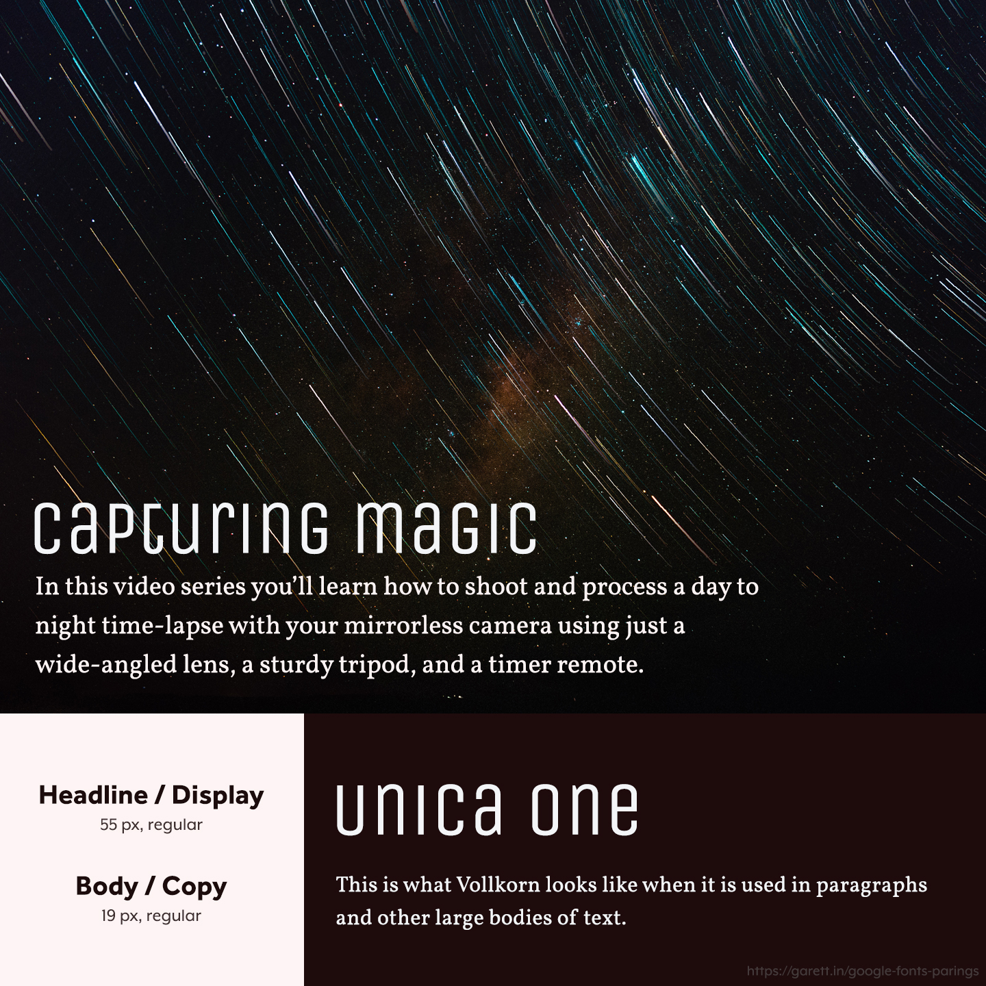
One of the more unique fonts you’ll find, Unica One as a headline option captures a mysterious and scientific feeling. Vollkorn is good for the body because it’s casual enough that it doesn’t take away from Unica One, but also keeps it grounded from being too far out there.
The Unica One and Vollkorn pairing works well for young, mysterious, unconventional, or futuristic brands with a modern vibe.
Spectral + Source Sans Pro
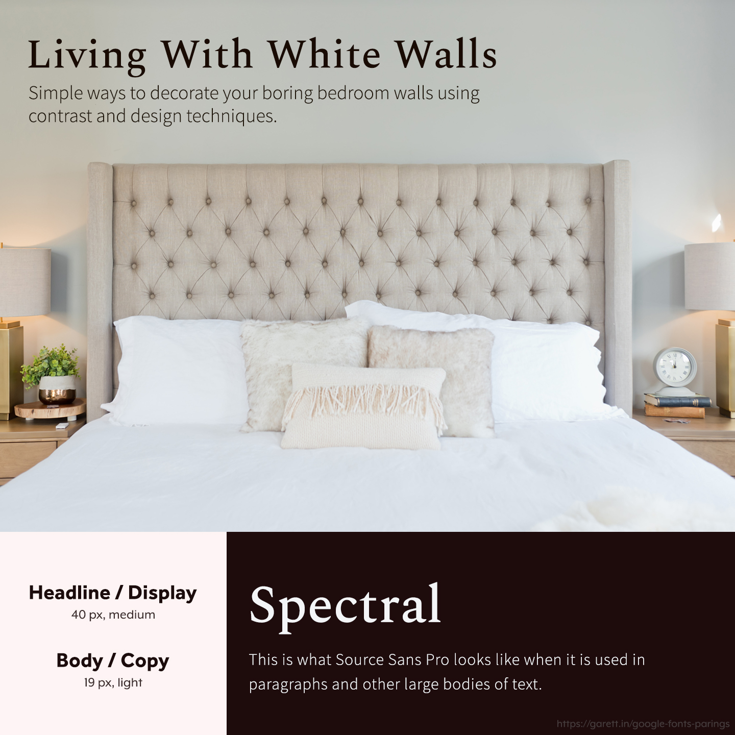
Spectral is a pretty type with it’s small serifs that flow nicely, which pairs well with Source Sans Pro, a modern sans serif with thinner lines. Together this pairing makes a more casual, but still professional tone.
The Spectral and Source Sans Pro pairing is especially great for brands in real estate and interior design. It’ll even work well for agencies and creative groups.
Patua One + Lora
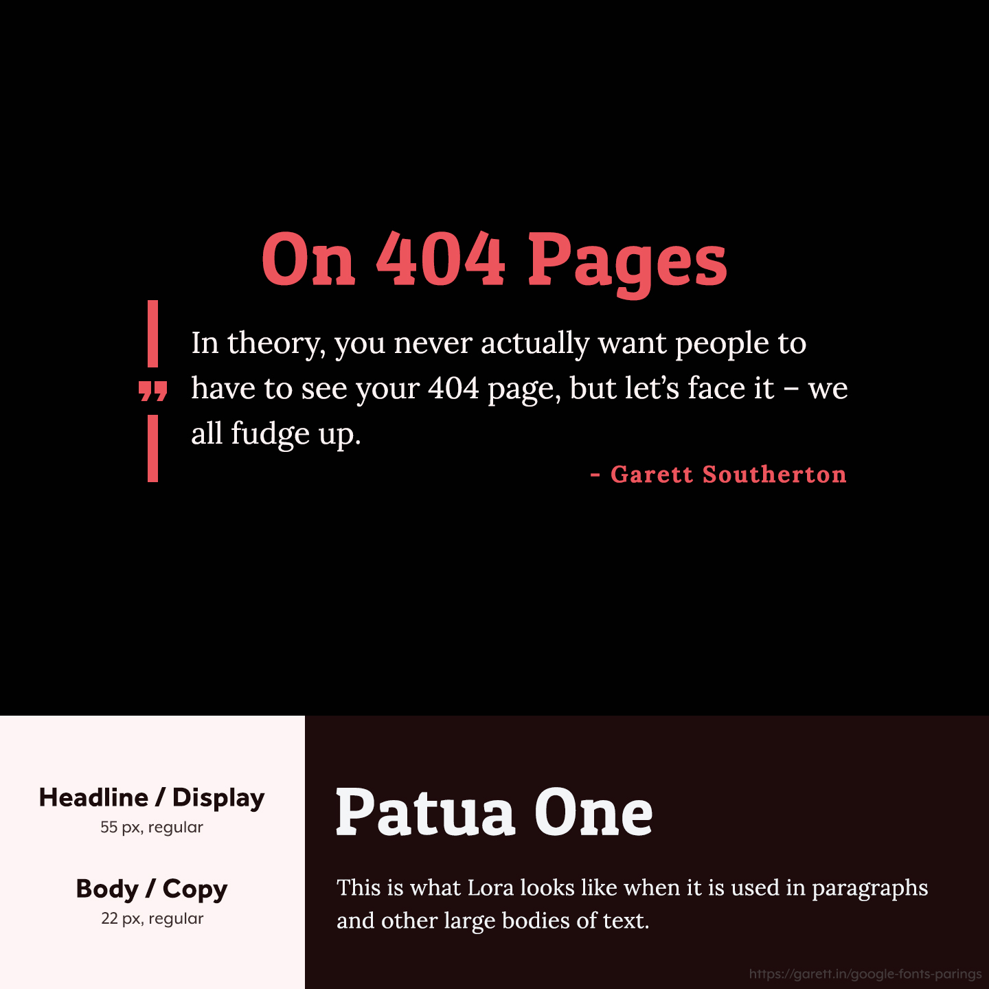
Patua One is bold and stands out, while Lora is modern and attractive with it’s curvy slab serifs and readability.
This Patua One and Lora font pairing is modernly powerful so it’ll work great for brands looking for a strong presence in any industry – influencers, tech companies, blogs, etc. It also looks great on quotes like my example.
Rancho + Gudea
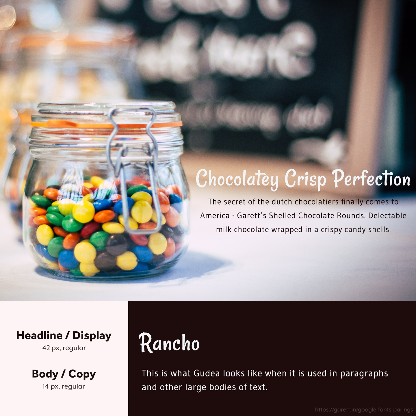
Rancho is one of the most playful fonts you’ll find on Google Fonts. Gudea matches that playful vibe in it’s own way that’s more suitable for body copy since it’s not too stylized.
The Rancho and Gudea font pairing work well for family-oriented, less traditional, and friendly brands in any space.
Quattrocento + Fanwood Text
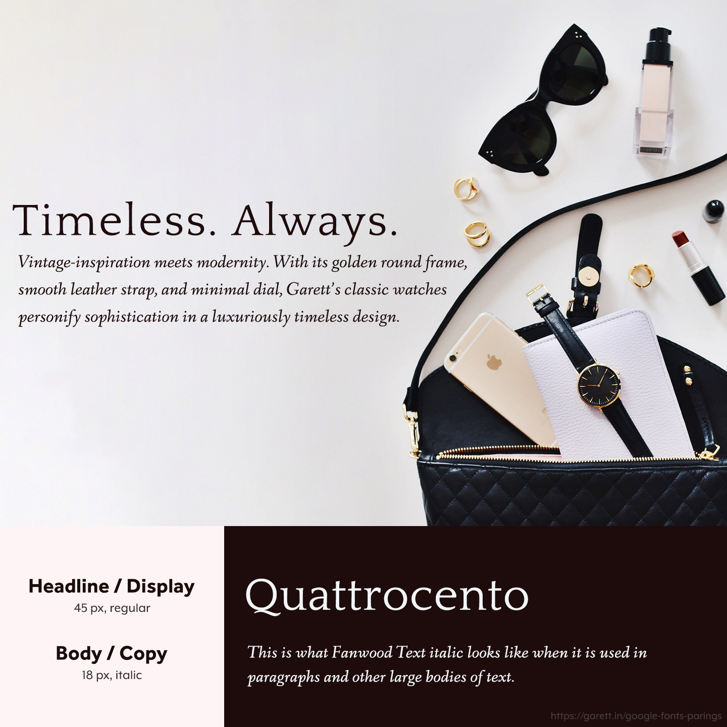
Need a timeless vibe? Look no further than Quattrocento and Fanwood Text. Quattrocento works great in all different font weights (thinner for elegance, bolder for strength) and Fanwood Text works well without styling, in addition to italics as shown because it’s classy and easy on the eyes.
The Quattrocento and Fanwood Text pairing are perfect for vintage, elegant, or timeless brands. Selling high ticket items works well with this pairing as well.
Oxygen + Noto Sans

Both Oxygen and Noto Sans are friendly feeling fonts with a minimalistic look. Being so minimalistic in this case makes this pairing versatile to work in lots of situations.
Pairings like Oxygen and Noto Sans work really well for professional service-based brands and agencies, but also fits brands in the educational space.
Raleway + Lato
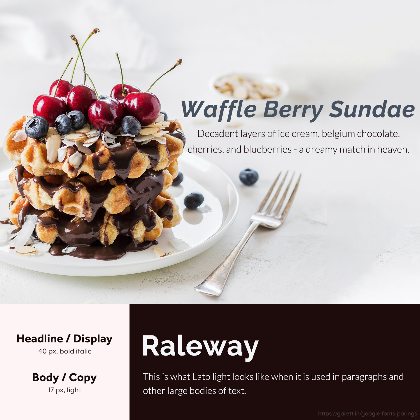
Raleway is such a versatile font that can transform tones with different weights, styles, and pairings. When paired with the light-hearted Lato, this pairing has an innocent and friendly vibe.
The Raleway and Lato pairing brings a relaxed tone that’s great for casual brands and websites, especially if they’re homey or family-oriented.
PT Sans + PT Sans Narrow
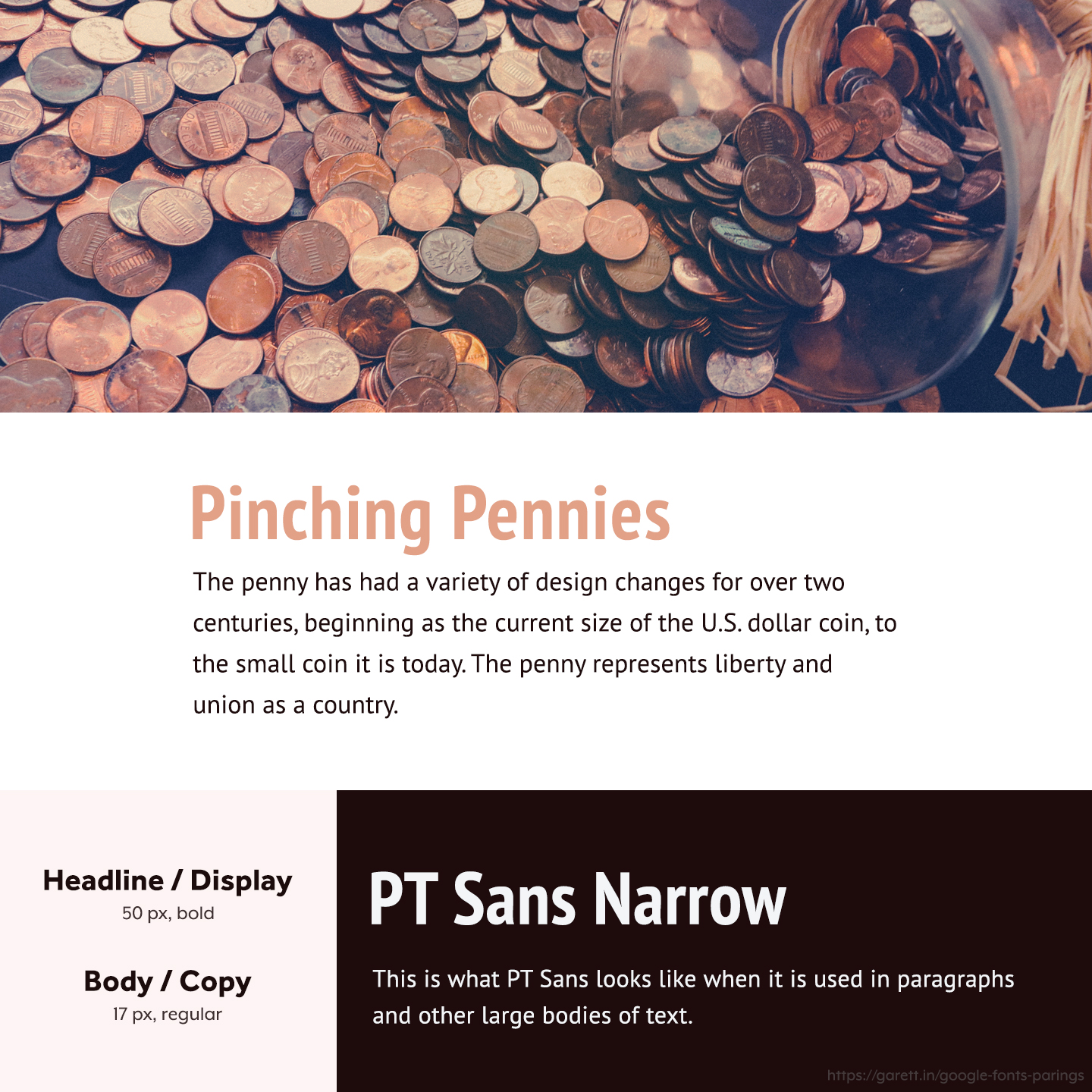
PT Sans Narrow and PT Sans are versatile font families with a plethora of options. In this combination, PT Sans Narrow on the headline spots gives the tone a slightly more authoritative feel, while regular PT Sans is an attractive look that’s easy to read because it isn’t as narrow. Together the pairing has trust building qualities while still keeping the mood on the more modern side.
This PT Sans and PT Sans Narrow pairing works well with brands in the financial, news, and media industries.
Palanquin + Trykker
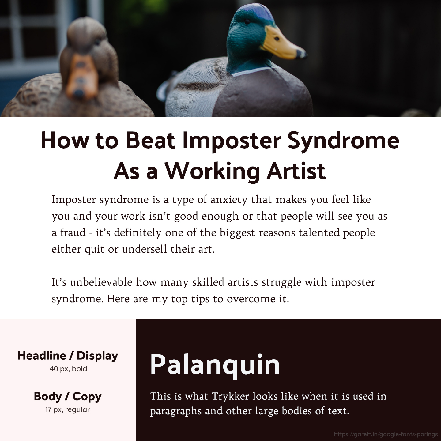
Palanquin is a beautiful tall sans serif that has a lot of personality, but when paired with the elegant Trykker, it makes for a magnetic visual style.
This Palanquin and Trykker font pairing goes excellently for more serious, luxurious, and powerful brands. The pairing will also look really great on articles and landing pages.
Ovo + Mulish
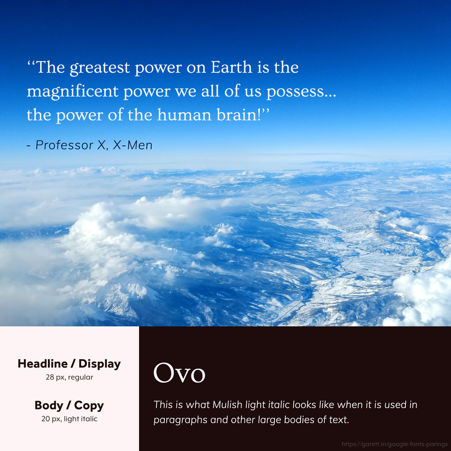
The curvature in the serifs of Ovo make it a really attractive font to use at bigger sizes, while Mulish is always a pleasure to see in body copy due to readability.
This Ovo and Mulish font pairing works for casual brands in tech, course creators, and handmade crafters, amongst others.
Nunito Sans + Nunito Sans

When in doubt, you can just “weight” it out. Within single-family combinations, you’ll often see just different font weights for headlines and body, such as the more versatile typefaces like Open Sans, Montserrat, and Roboto. What made me decide to use Nunito Sans in this article is simple, it’s an attractive sans serif that you don’t see often.
This Nunito Sans family pairing is good for agencies and SaaS brands, as well as other brands in the B2B space.
Clicker Script + EB Garamond
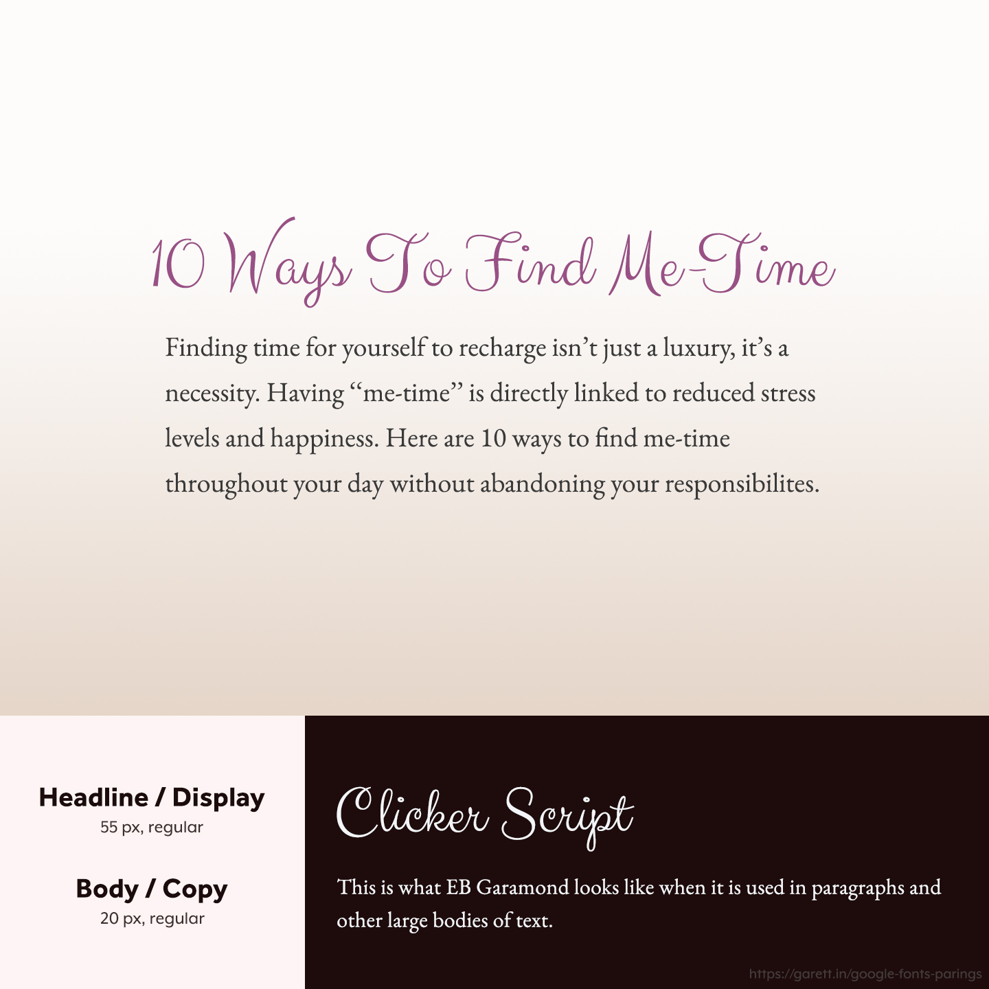
The list of non-obnoxious (read: usable) script options available on Google Fonts is a short one. Clicker Script works great for feminine and whimsical brands as a headline font choice while EB Garamond pairs nicely due to its subtle serifs that are buttery smooth.
I like the Clicker Script and EB Garamond pairing for brands that are whimsical, festive, casual, or light-hearted.
Numans + Quattrocento
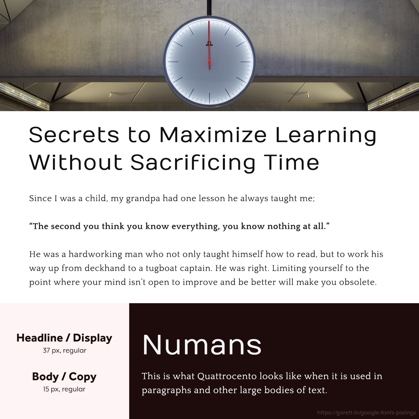
I love this minimal pairing because it draws you in to keep reading. Numans is super smooth yet different enough to get your attention, while Quattrocento is wide and flows beautifully in copy.
Brands that are on the more casual side with lots of copy (like infopreneurs or businesses with a lot of funnels) will benefit most from this Numans and Quattrocento pairing.
[convertful id=”111296″]
Merriweather + Raleway
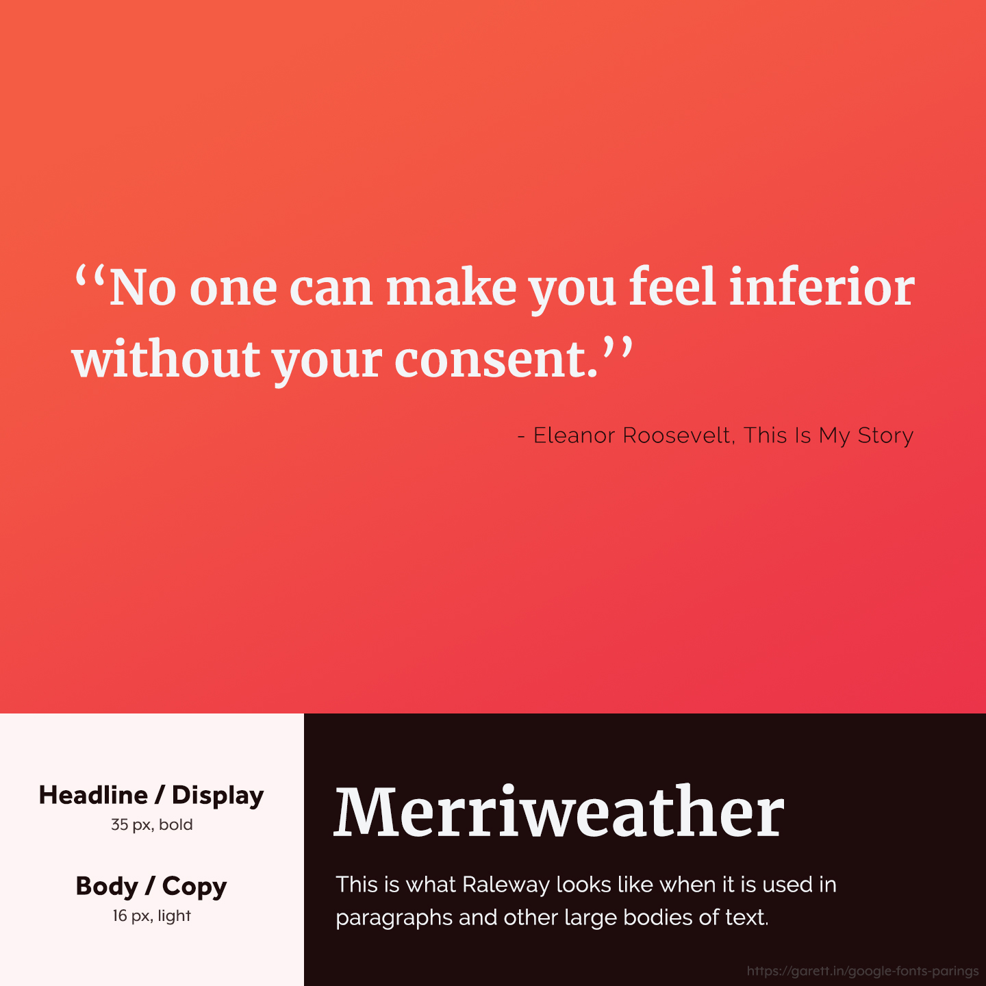
I’ll admit Merriweather is one of my favorite serifs, but for good reason, it’s a classic that never gets played out. Paired with Raleway, this font combination is between that fine line of casual and formal.
I believe this Merriweather and Raleway pairing fits perfect for bold and irreverent brands, but also works for brands that need a more serious look while keeping it friendly.
Martel + Karla
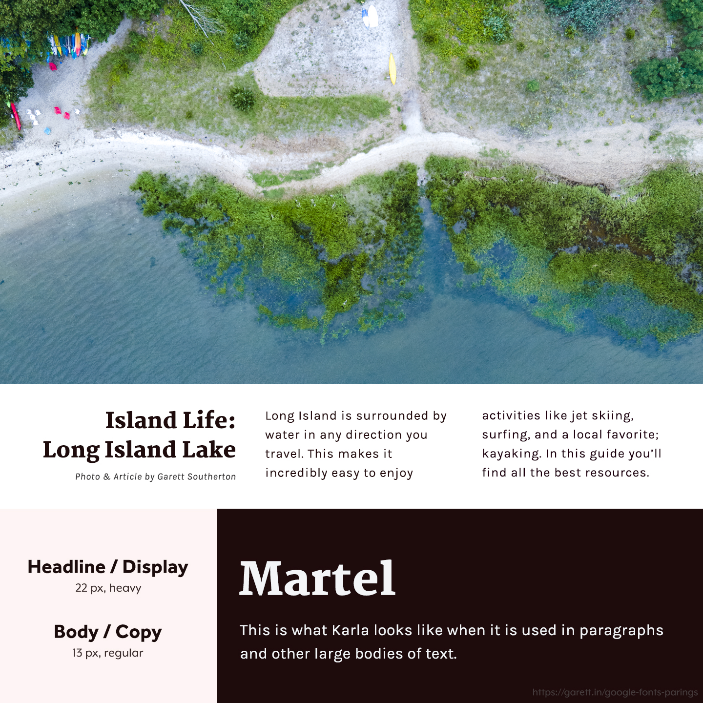
Martel is the perfect headline font for article titles and slogans with it’s thick slab serifs, while Karla is an easy-to-read font that pairs nicely because of it’s spacing and curves.
The Martel and Karla pairing is ideal for blogs and magazines because of its readability. I like it for travel brands and websites with lots of articles or magazines.
Kanit + Maitree
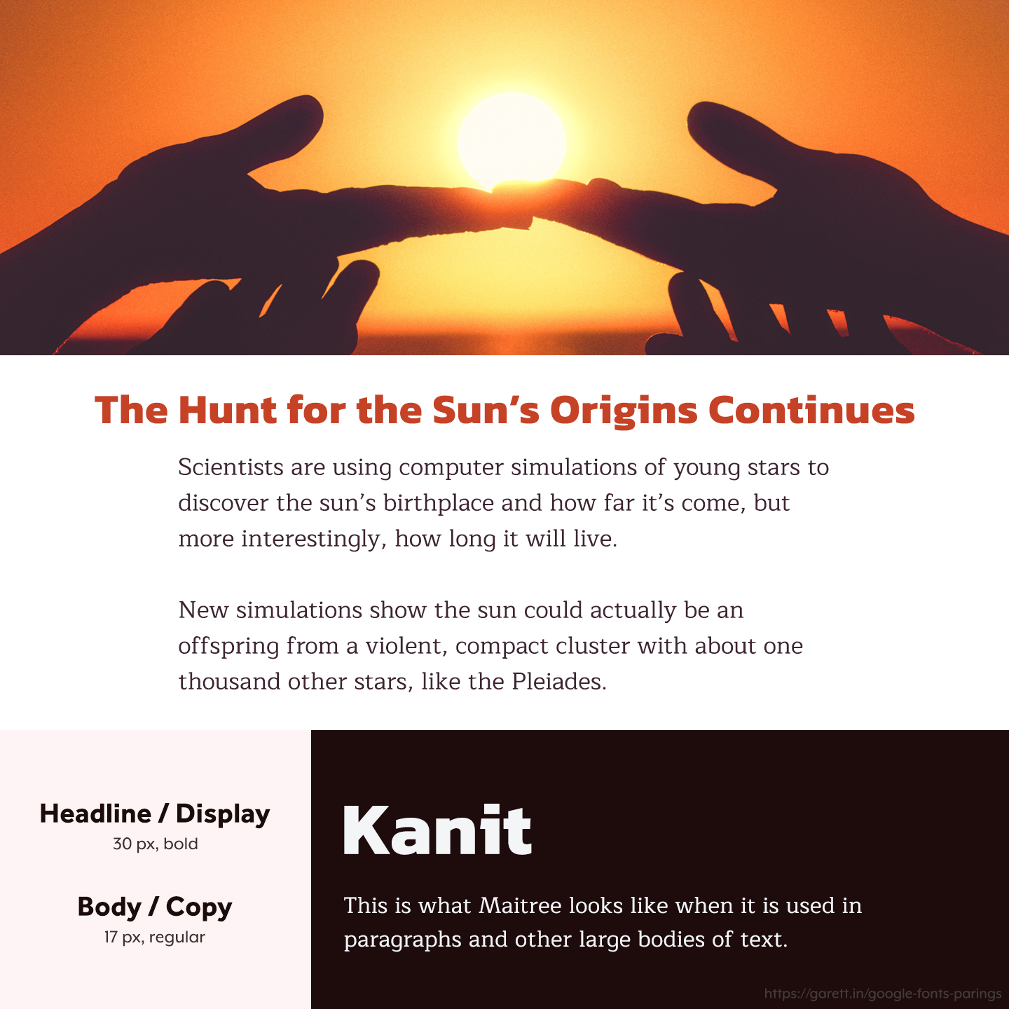
Kanit is a stylish font that works well when brands need to feel powerful, but not corporate or luxurious. Maitree is on the opposite end of this spectrum being more formal, but not too formal.
The Kanit and Maitree pairing is a great fit for news, science, and other futuristic brands with a more serious than casual tone.
Inconsolata + Montserrat
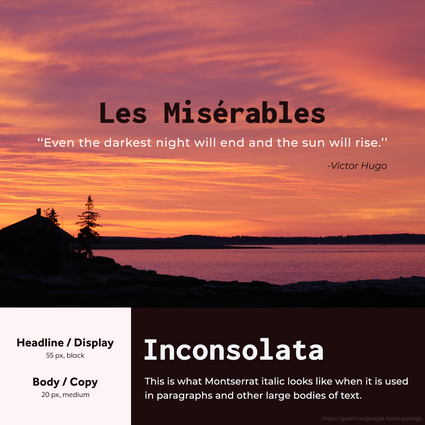
Inconsolata’s monospace style gives it a sense of stability and strength, while Montserrat is modern and inviting. Italicising Montserrat will also give it a sense of sleekness. Together this pair is versatile and can fit most modern visual styles.
The Inconsolata and Montserrat combination is best for trustworthy brands on the slightly more serious side, but good for most modern brands.
Flamenco + Asap
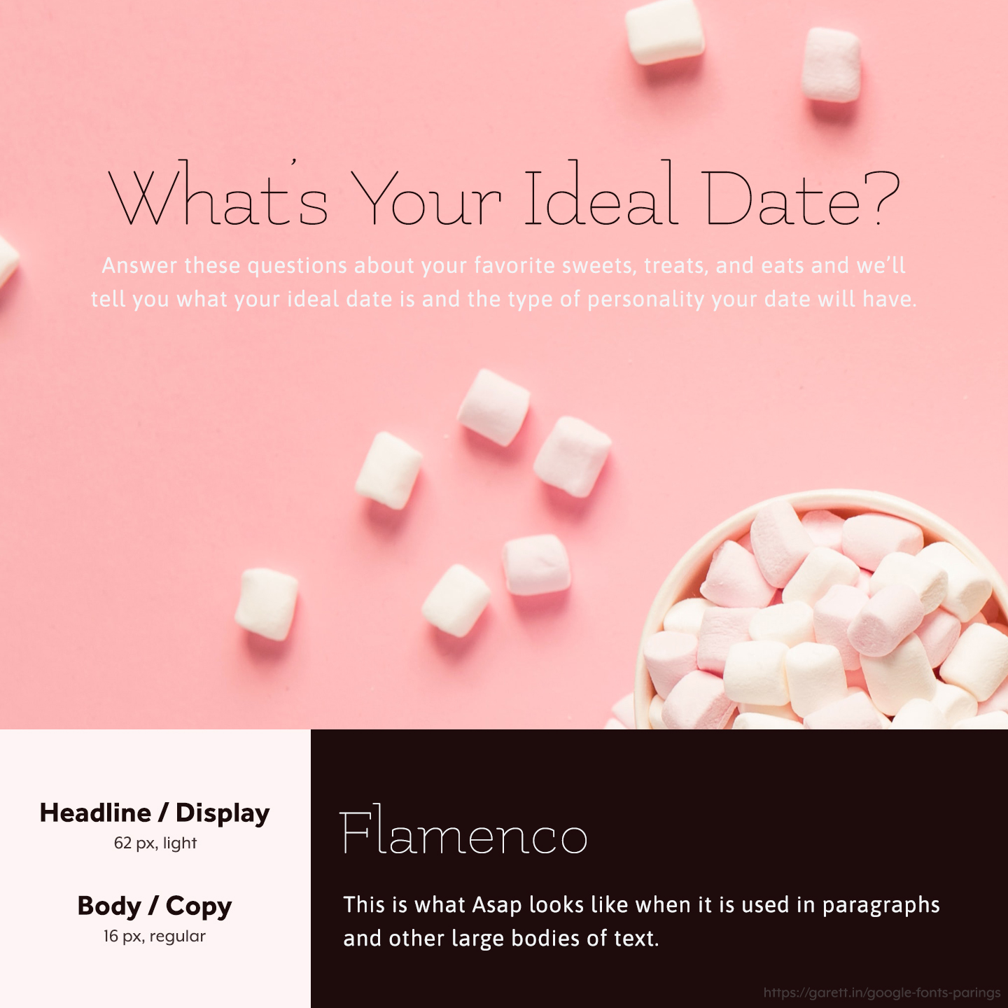
What I love about Flamenco is its versatility. It can portray a more unique flirty vibe you don’t see as often, or it can even play chic and royal. In this case paired with the colors and copy, we’re going for flirty. Asap is smooth and pairs really well with the thin lines of Flamenco.
This Flamenco and Asap pairing can fit posh, desirable, royal, trendy, or light-hearted brands depending on the colors used with it.
Eczar + Gentium Basic
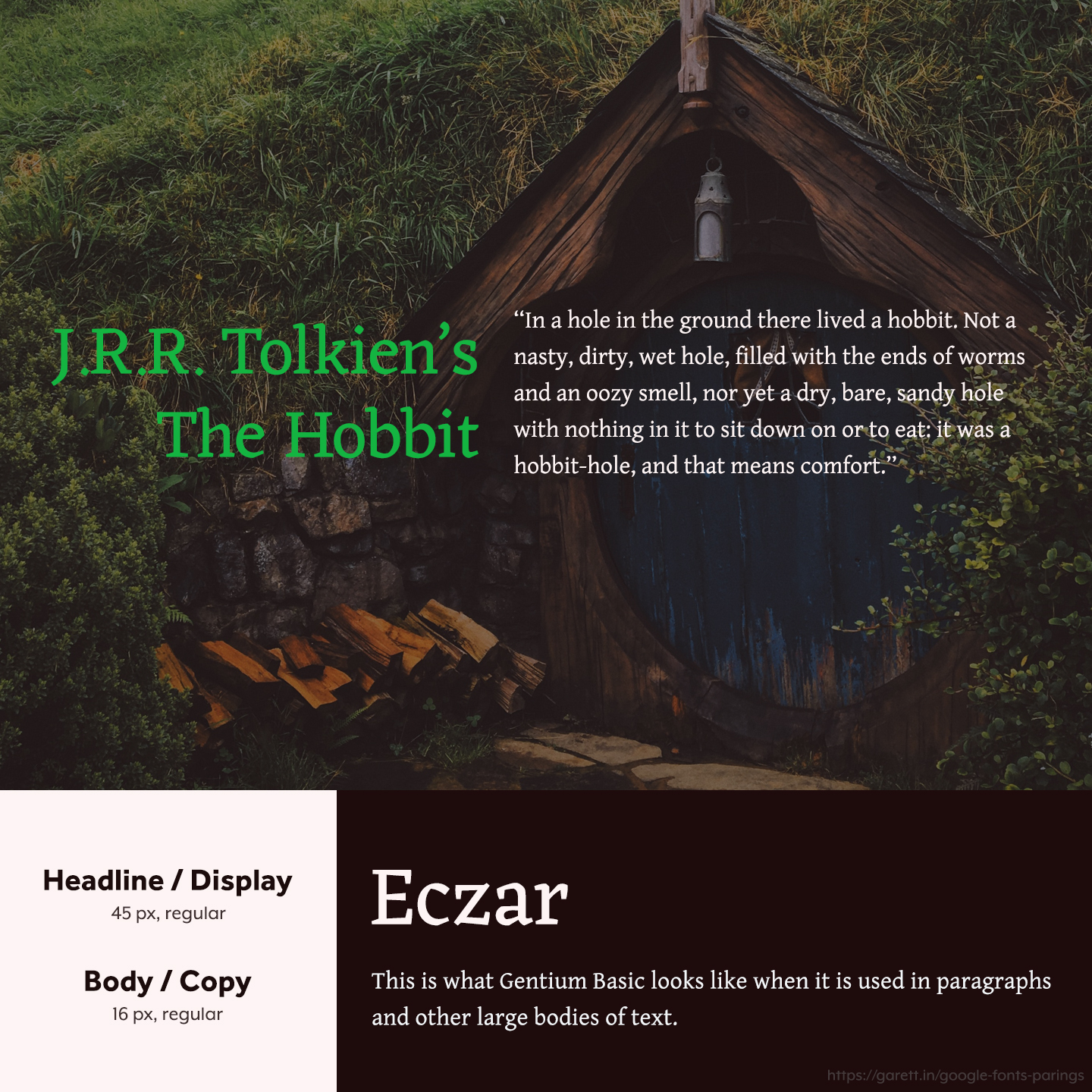
Eczar has lovely round curves which makes it a bit more playful than traditional serif typefaces while Gentium Basic has a classic look and is easy to read. When paired it brings an inviting tone to the conversation.
This Eczar and Gentium Basic pairing pulls really well for writers, but definitely isn’t limited to them as any whimsical or fun brand could work with it.
EB Garamond + Sarabun
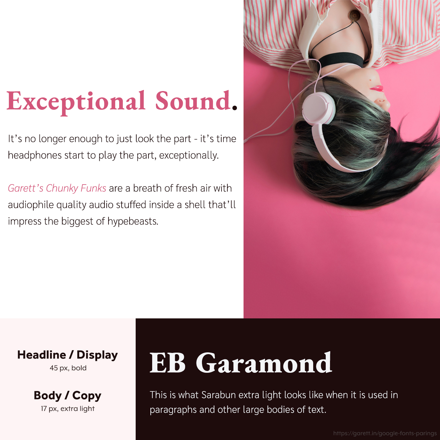
Flipping EB Garamond as a display font gives it such an authoritative tone, but when paired with lovely Sarabun, the combination together is a bit more inviting while remaining powerful.
Pairing EB Garamond and Sarabun is a great fit for brands that offer cutting edge, daring, or bold products.
Baloo 2 + Poppins
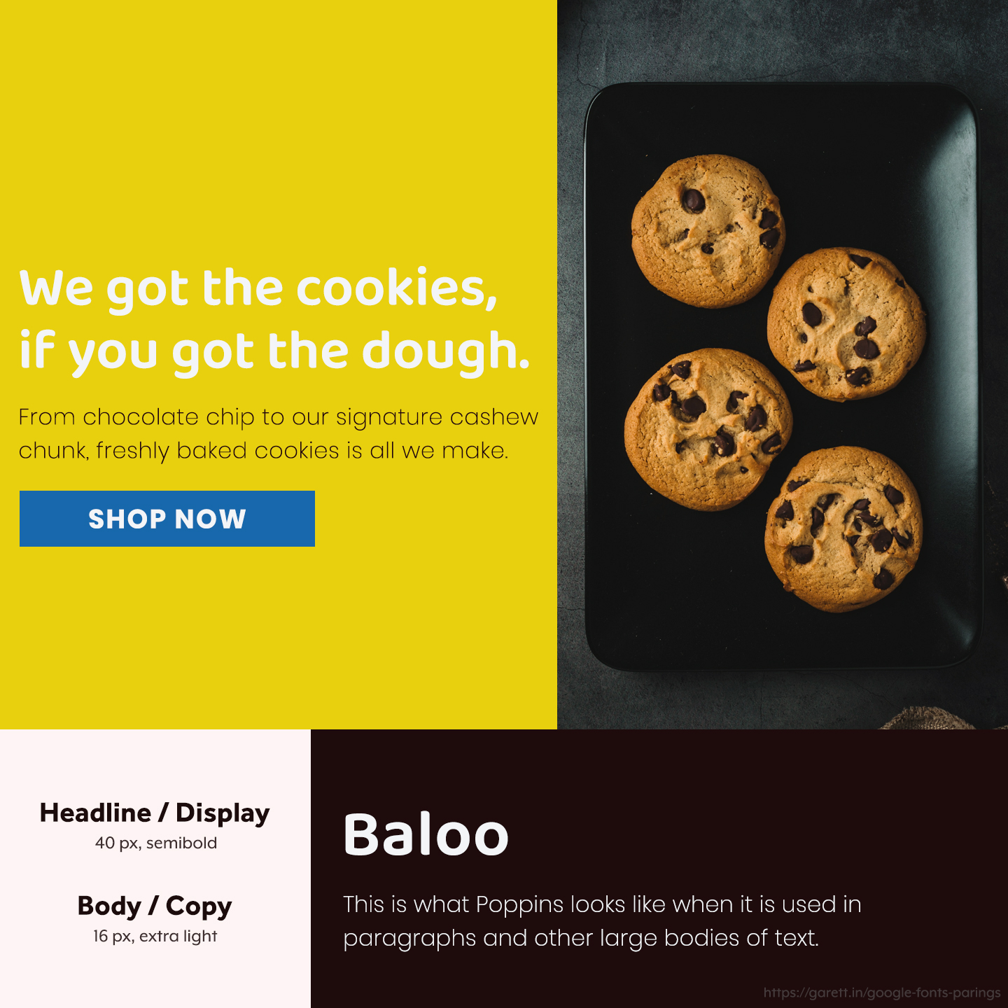
Baloo 2 is a really fun font that makes everything a bit more playful and inviting. Poppins shares the same tone in it’s own way, but is a little more suitable for longer body copy as it’s thinner and more spaced.
I love this Baloo 2 and Poppins pairing for brands that are homey and family-oriented, but it also works for lively brands in the food, tech, or service industry.
Dosis + Spartan
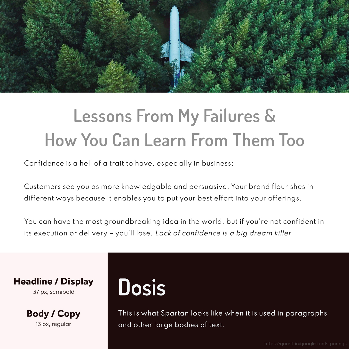
The rounded curves of Dosis make it more friendly, while the tall letters give it a trustworthy feeling. Spartan is a clean sans serif that’s great for readability with a mature tone.
The Dosis and Spartan pairing is a nice look for modern brands looking to build trust, authority, and confidence with their audience.
Berkshire Swash + Josefin Sans
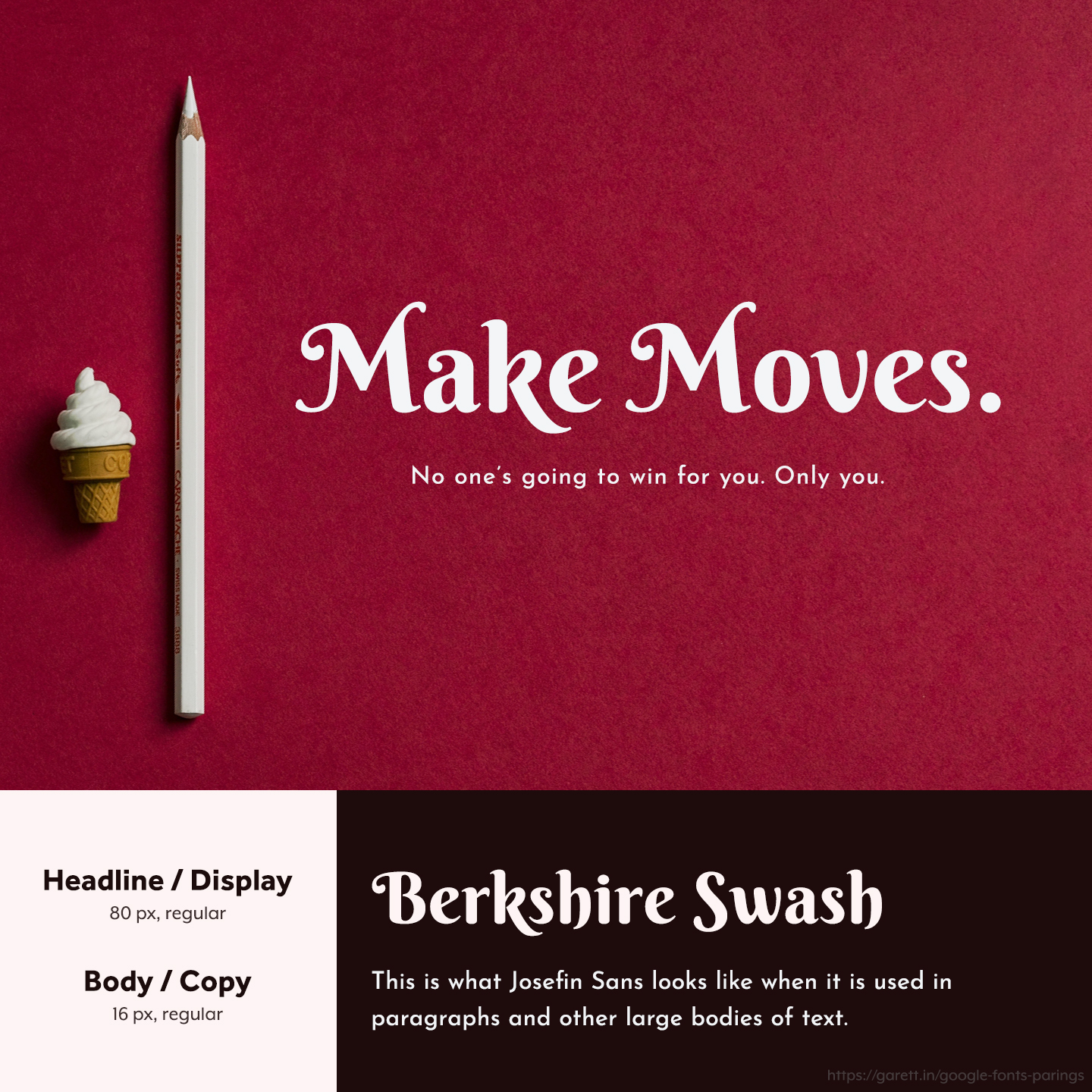
Berkshire Swash is perhaps one of the most striking Google Fonts options right now, so it’s perfect for headlines with it’s curves and swirls. Josefin Sans isn’t too far from being a standout itself as it’s got great angles and character. This is one of those rare cases where two eye-catching fonts pair really well together.
This Berkshire Swash and Josefin Sans pairing is versatile and works well for brands that try to buck the curve. Empowering, casually elegant, and irreverent brands will wear it extra well.
Cormorant Garamond + Fira Sans
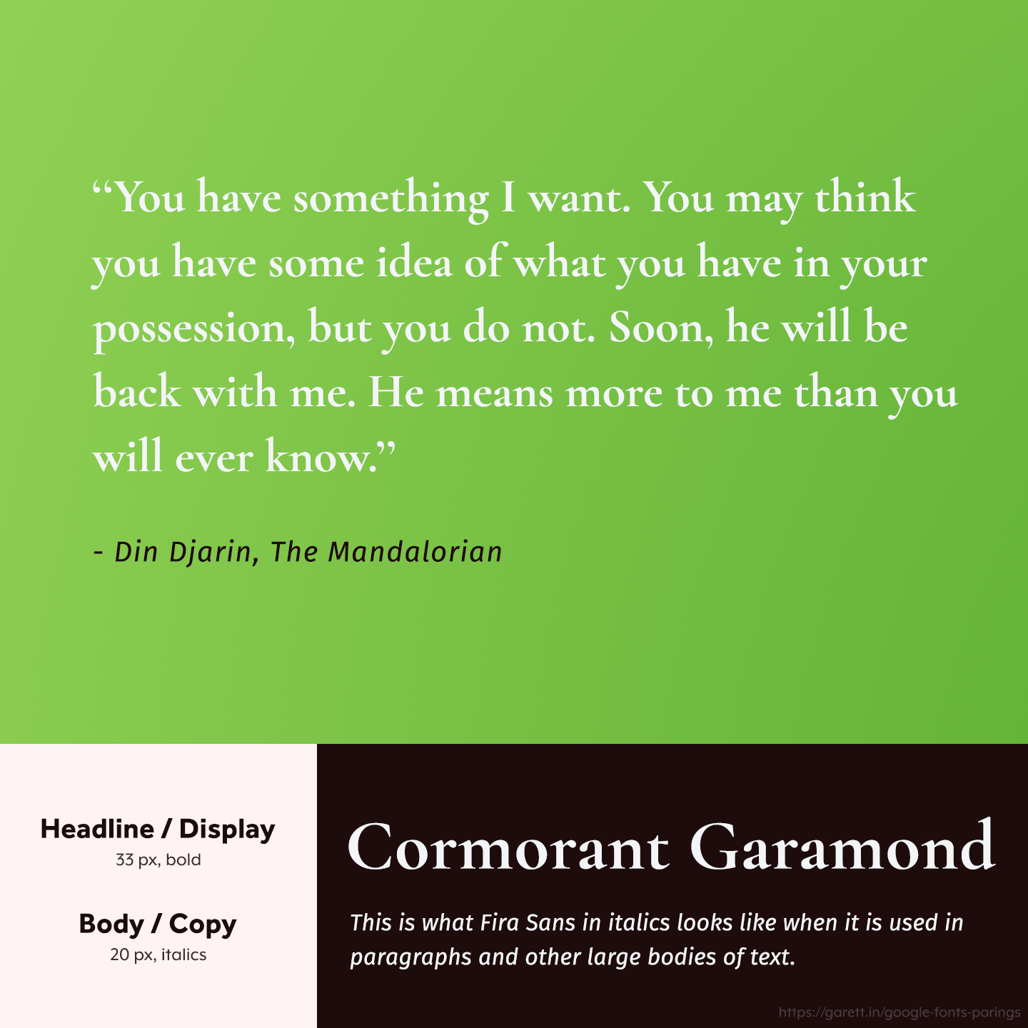
Cormorant Garamond has a lot of qualities of a traditional serif, it’s like a modern day Times New Roman. Fira Sans on the other hands, is a smooth sans serif with a little bit of flair – which tones it down from being too formal.
The Cormorant Garamond and Fira Sans pairing works well for assertive, compelling, bold, or irreverent brands. I also really like this pairing as a visual style for designs with big typography.
Arvo + Roboto
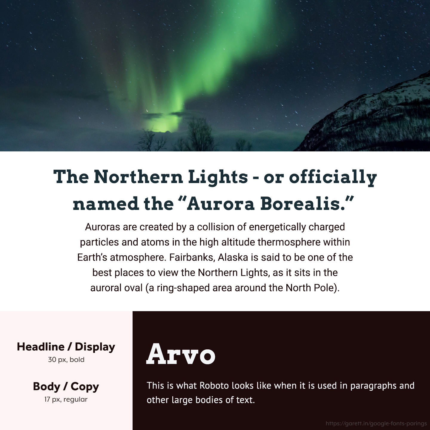
Roboto is a classic Google Fonts choice for body text because it can be either casual or formal based on the headline pairing. With Arvo, this font combination has a serious, but inviting tone.
I like this Arvo and Roboto pairing for travel, outdoors, and even fashion brands.
Bitter + Work Sans
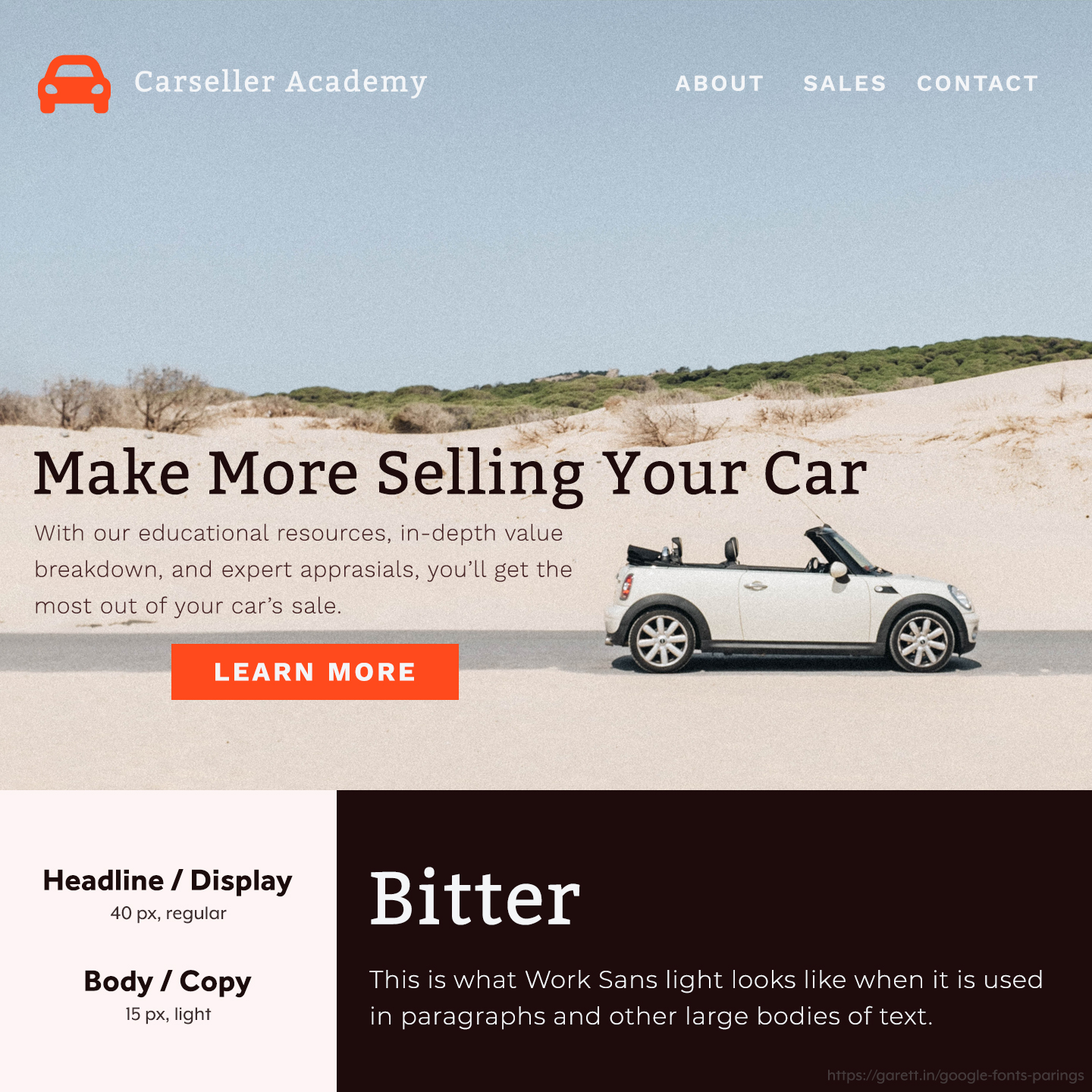
Bitter has a beautiful contemporary style with a look that stands out, while still being easy to read. Whereas Work Sans is similar to the beloved Montserrat (for all the right reasons), it’s just used less.
This Bitter and Work Sans pairing is extremely versatile; from brands selling educational content to SaaS memberships. You can’t really go wrong with this modern, smooth pairing.
Bonus tip: Work Sans in caps with a bold font weight works great in this pairing for buttons and navigation.
Neuton + Mulish
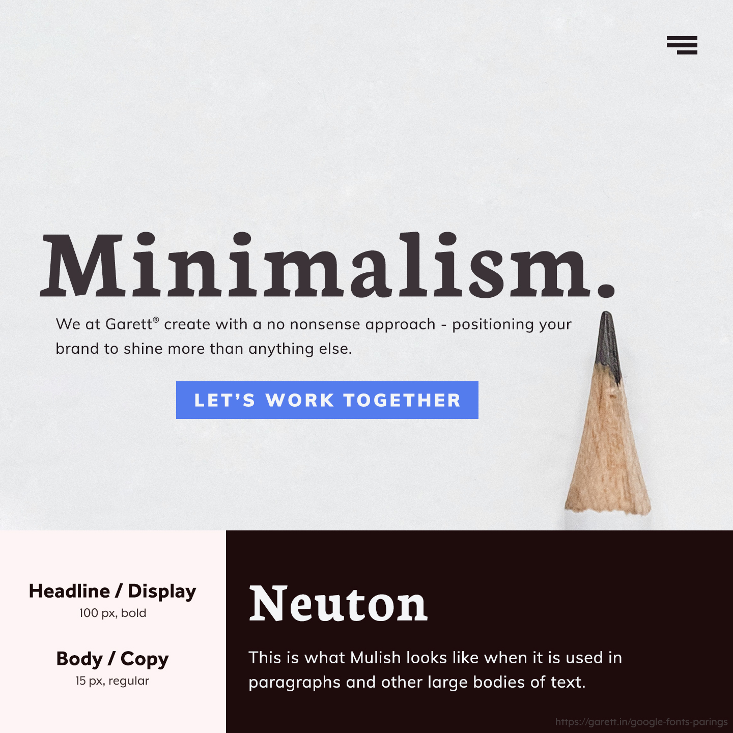
This minimalistic pairing really calls for attention because Neuton is a super smooth serif with perfect curves and angles, while Mulish is contemporary and invites you to keep reading. If I were to rebrand my business today, this would be a strong contender.
Bold and powerful brands with straight-forward messages will benefit most from this Neuton and Mulish pairing, but it will really work for mostly any brand that isn’t too formal or quirky.
These Google Fonts pairings can literally change your brand’s vibe
Glow ups aren’t just for teens turning into adults. With the right typography, your brand can transform it’s viewpoint in your customer’s eyes. When your font pairing matches your brand’s persona it elevates your messages and adds a level of authenticity.
If you’re unsure of how to download or use Google Fonts on your website, I’ve detailed that on my first Google Fonts combinations article.
Which of these Google Font pairings is your favorite? DM me on Instagram and let’s talk all about typography.