What are 404 pages?
A 404 page is where visitors get taken to when they attempt to visit a page that has moved or is non-existent on your website. There are many reasons this could happen; typos, broken links, changed URLs, server trouble, etc.
In theory, you never actually want people to see your 404 page, but let’s face it – we all fudge up.
Do you need a 404 page?
Without a doubt that if you have a website, you need a 404 page. When a visitor hits a broken link or moved page and you don’t have an actual 404 page it will send off the server default one – which looks quite scary and is frustratingly unhelpful.

Luckily if you have a WordPress site or are using a builder, you most likely have a generic one by default. The default 404 page is better than not having one, but you should add to it and maximize its effectiveness.
An effective 404 page benefits your brand:
- Explains what happened to prevent confusion and frustration
- Saves traffic from leaving the site
- Guides visitors to other pages and products
- Enhances strength of relationship with customers
- Showcases your brands personality
What should your 404 page have?
The best 404 pages are strategic enough to keep visitors on their site and going through more content. It also helps when you have something out of the ordinary to catch their eye – this is where you can let your brand’s personality shine.
Use positive language in your copy
Write a headline and sentence explaining that the page your visitor tried to visit doesn’t exist or has moved. Nobody wants to be even more frustrated not knowing where the page they were looking for is.
Shape the language to be positive and highlight that it isn’t your visitors fault. Not doing so can subconsciously can have a negative impact on them.
List relevant links with a call-to-action
It’s a good idea to link the visitor to your most popular pages to peak their interest. Check Google Analytics to find your top visited pages and use data when you make your link choices.
You could also link your navigation, top sales pages, or blog if you have too many popular pages.
Remember that unless you give a clear action that you want your visitor to take, the list of links will be less powerful.
Consider using a search box
It’s not necessary to use a search box if you have a fairly small website, but it’s definitely helpful. The visitor was looking for a specific page in the first place so allowing them to search directly from the 404 page would be helpful.
As with most things, less is more
Don’t list links to every single page on your website. Also, don’t go crazy with your photo album or have 50 different things at once going on. It will overwhelm your visitors. Keep it simple.
Allow your personality to shine
Most 404 pages are boring since they just list the error and send you on your way – that’s why creative 404 pages shine!
Typically no one wants to land on a 404 page while they’re looking for a specific page so making it fun softens that blow of potential frustration to your visitor. It could also help make your brand more relatable and likable.
Keep your 404 page consistently on brand
While having fun remember to keep it consistent to your brand – as you should always. Stick to the colors, fonts, and vibes your customers can expect from your brand.
Taking a look at my 404 page
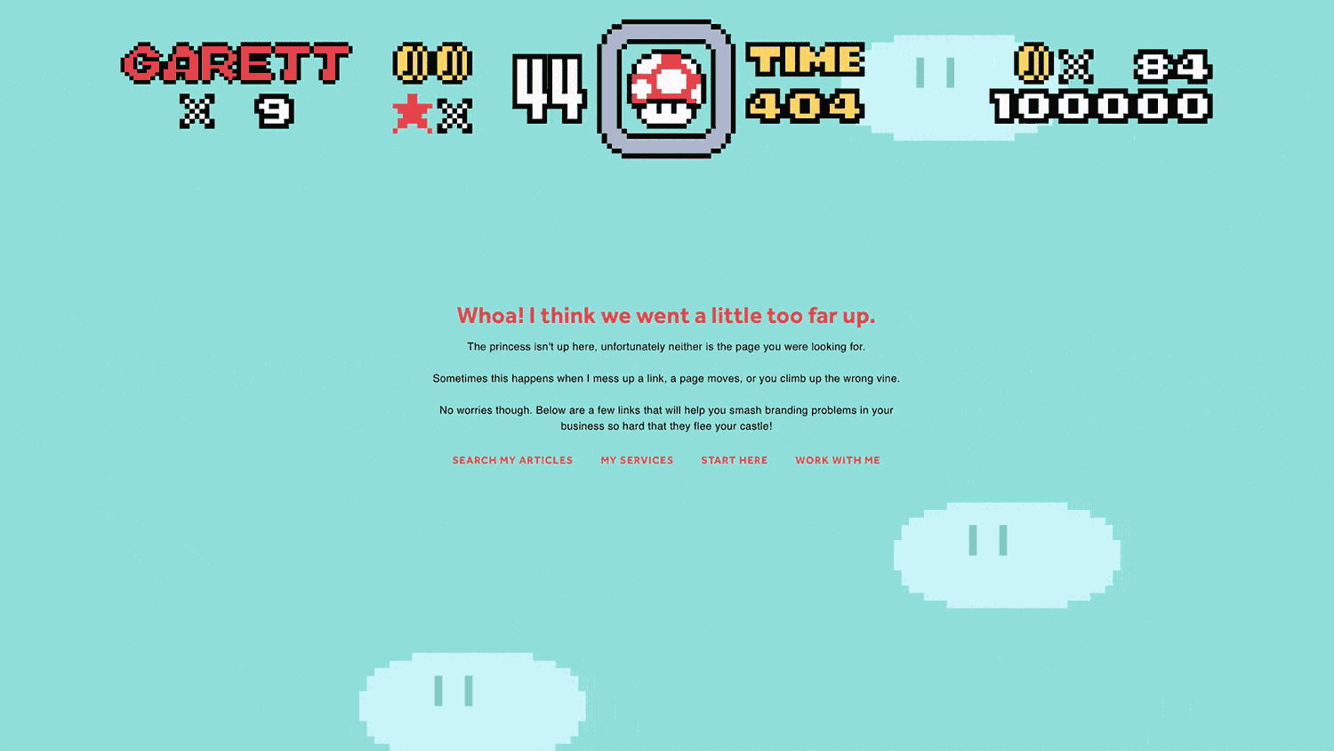
For my 404 page I had two things in mind; keeping it light-hearted by showing my geeky side and displaying what I could do with code-based animation. This is how Super Garett World 404 was born.
While you get glimpses of my geeky side on social media and these articles, it’s a nice Easter egg to see it in full force on my business’ website.
It’s a whole lot of fun with the illustration and animation, but the copy makes it clear that the page is missing and what the visitor can do from here. Also you can note that while the animation is a bit different from my site, I still have branded it with my name, colors, and typography on the copy to let you know it’s me.
7 creative 404 page examples
Amazon
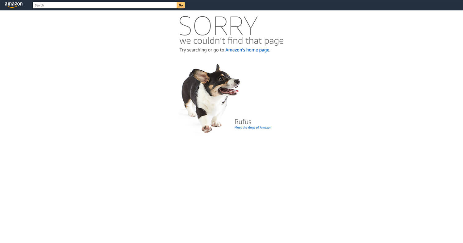
Amazon needs no introduction. Keeping it super simple, they’ve stripped their normal navigation and 100+ links in favor of a search bar, a link to their homepage, and a less obvious link to “meet the dogs of Amazon”.
Upon each time you hit the 404 page, it loads a random employees’ dog, which makes it less frustrating that the product you’re looking for isn’t there. Oh – and seeing such adorable puppies makes me (and most people) happy!
This 404 page does a wonderful job at two things; giving the visitor a quick way to find the product they want and shows the human side of Amazon (and their employees).
Bonus: the less obvious “Meet the dogs of Amazon” link helps you discover Amazon actually has a blog, and the article with the dogs of Amazon is adorable.
Giphy
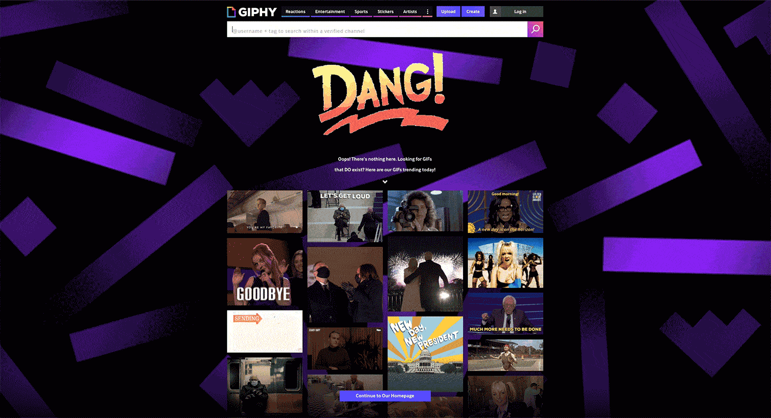
Giphy is my favorite go-to GIF factory (and I send a lot of GIFs via text).
What makes Giphy’s 404 page so great is that it’s boldly on brand. There are a few different variations of animated backgrounds and words “Oops”, “Woof”, or “Dang”, but they all capture that Giphy spirit – there’s a GIF for every moment.
It’s also great that they explain the GIF (or page) searched for isn’t there and show the current top trending GIFs, as well as a link to the homepage. The trending GIFs are usually relevant to what’s going on in pop culture, headlines, or holidays – which keeps you motivated to use a GIF that you’re likely relating to.
Spotify
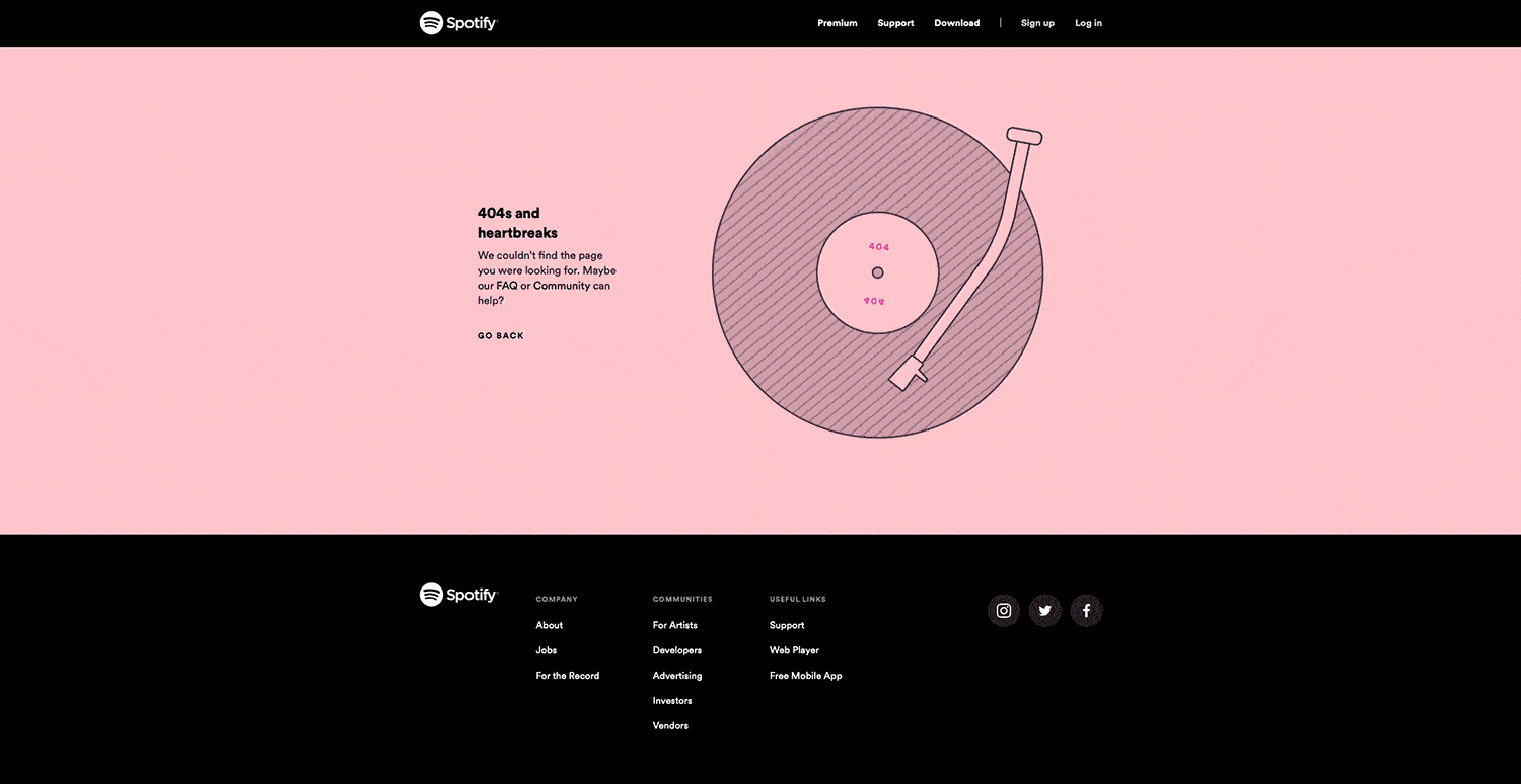
Spotify nailed it! I love a good wordplay, especially when it’s highly relevant to the subject matter and explains a situation.
For those that don’t know, 808s and Heartbreaks is Kanye West’s famed entry into R&B, so flipping that album title into 404 (the type of page) and heartbreaks (an exaggeration of the feeling you may have when the page you’re looking for isn’t there) is genius.
The vinyl animation is entertaining enough to lighten the mood and the copy is clear, directing you to their FAQ or Community to help you find what you’re looking for.
The New Yorker
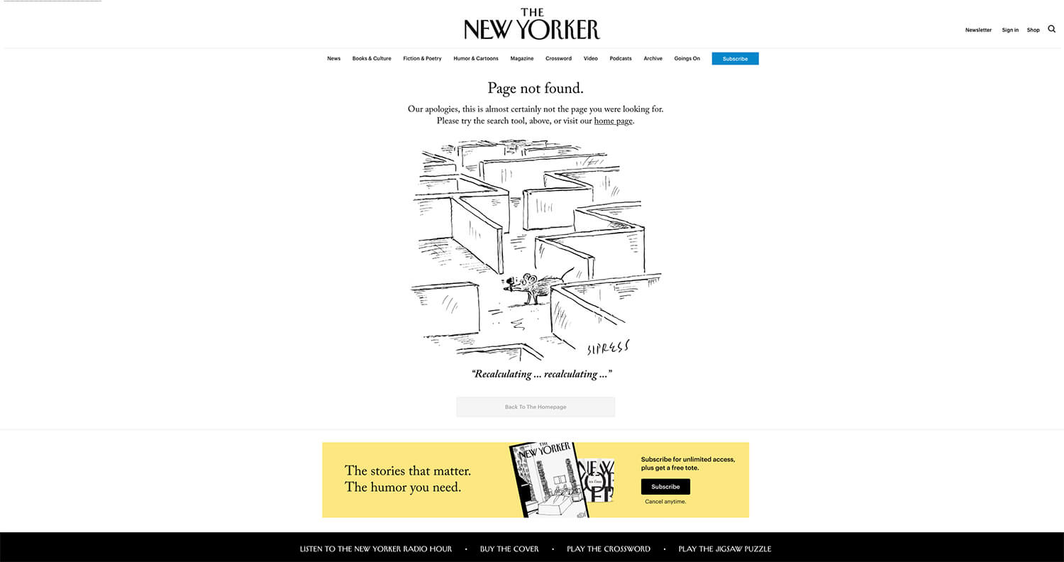
Famed magazine The New Yorker has no problems with staying on brand in their 404 page. Being famously known for their comic strips and political cartoons, they commissioned a comic panel of a mouse lost in a maze saying “recalculating… recalculating…” – a common feeling when hitting a 404 page.
This strip is funny, cute, and really on brand for The New Yorker. When you pair it with a straightforward message about the error and inviting the visitor to search or goto the homepage, you have a memorably effective 404 page.
Dribbble
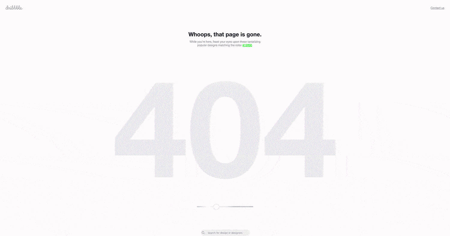
Dribbble is a website where designers get inspiration and post their work as inspiration for others. What makes their 404 page great is that it’s interactive and pushes a visitor into checking out potentially 100s of other designs.
Upon loading the 404 page, 54 design thumbnails based around a specific color snap into the shape of “404”. Each load is a random based color, but there is a slider right underneath that allows you to adjust what color projects are pulled. This keeps the target visitor finding new inspiration!
Aside from the near endless supply of inspiration links, Dribbble does a good job to make it clear that the page is gone and even provides a search box at the bottom of the page.
For those wondering, it’s not uncommon for posts on Dribbble to be deleted when designers post new work or before client launches, so a good 404 page is definitely needed.
Xbox
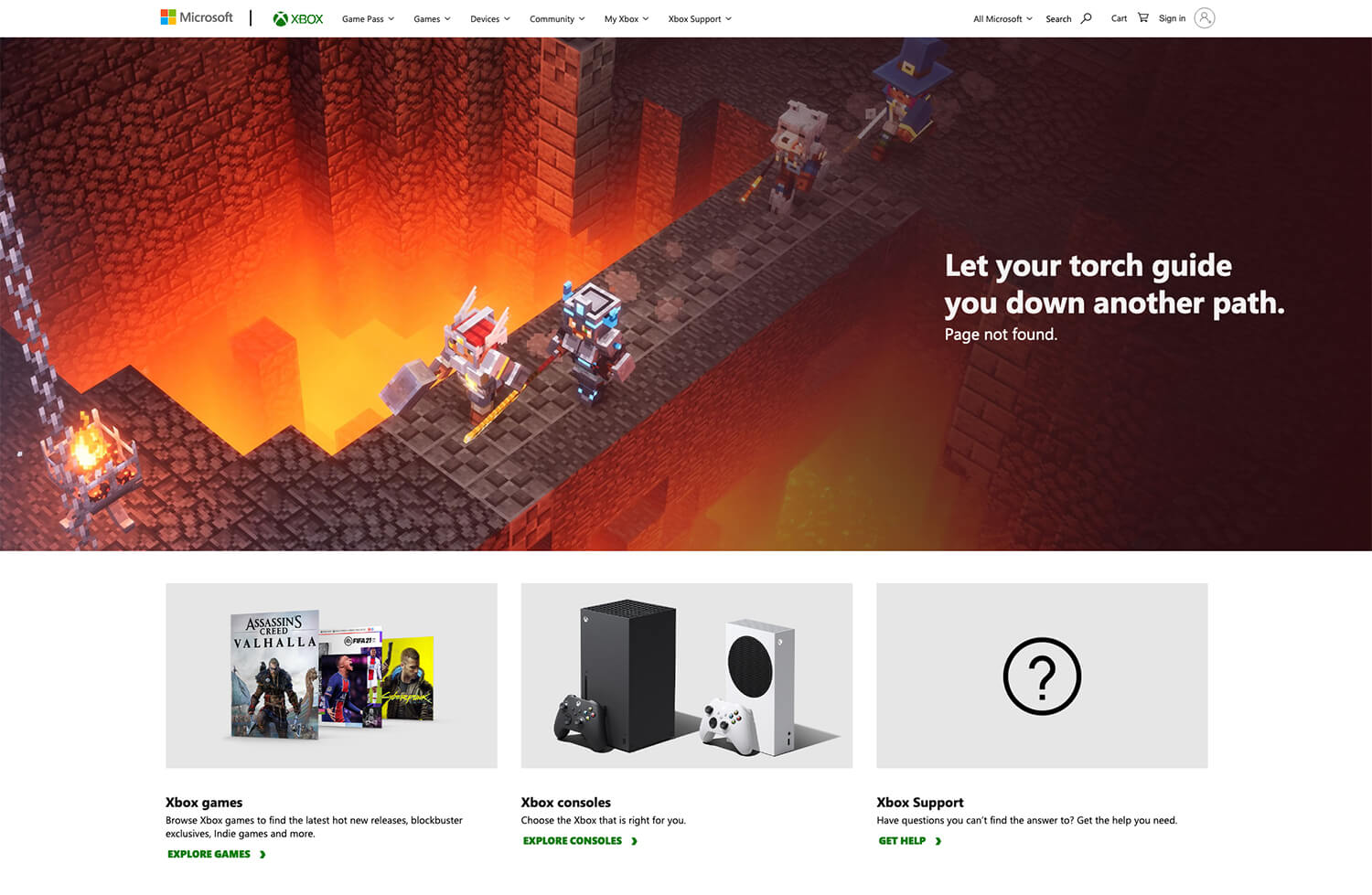
Gaming culture is all about fun times and cheeky puns so it’s only right that Xbox’s 404 page doesn’t disappoint. At the top they pull a random header image with a matching pun from some of their most recent exclusive releases.
Beyond the fun, Xbox’s 404 page does a good job of directing visitors towards one of three common objectives; checkout the latest games, see what consoles we offer, and get the help you need to enjoy your Xbox experience.
Marvel
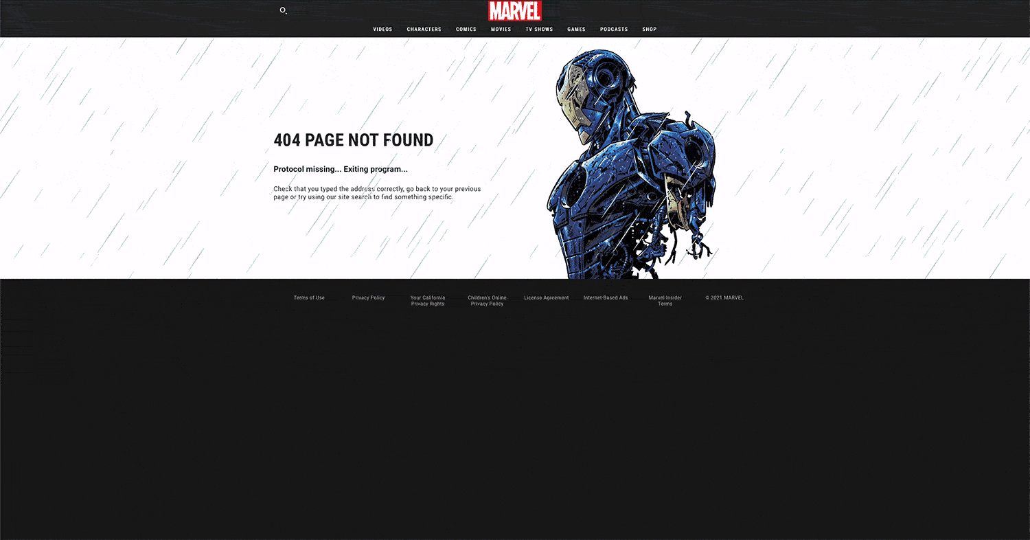
Marvel is one of those fandoms that if you’re into their characters, then you’re all in and they really capture that with their 404 page.
Simply upon landing on the 404 page you’re greeted that the page isn’t found, actions of what to do next, and one of six animated characters with headlines that match their personas and stories.
Despite Spider-Man not being one of the characters, this is still a great 404 page because it tells you clearly the page isn’t found and to use the search bar to find what you need. Also note that the animations and small related headlines like “HYDRA is currently attacking this page” really bring a smile to a fan’s face.
Maximize your 404 page by being memorably helpful
Animation and interactive experiences are all the rage
With animation and interactive experiences you can really strengthen your brand and excite your loyal audience. As a fan of Marvel, seeing all my favorite characters on the 404 page makes me feel closer to the brand even though I hit a dead page.
Opportunities to show another side of your brand
Brands like Amazon sometimes often get a bad wrap and appear heartless (or humanless). As you can see, 404 pages are a good opportunity to showcase something that would otherwise be too random to put elsewhere. Whether it’s dogs, employees, or just showing your geeky side, this is a great chance to do it.
Be clear and concise in your messaging
Likely already frustrated, no one wants to read 3 paragraphs about why the page they’re looking for is gone. Give them a sentence or two stating that it’s gone and what they can do about it… make them laugh while you’re at it and you’ll win them over.
What are your favorite creative 404 pages on the web? Let me know on Twitter (@GarettCreative)!